Design Canvas
The K2 Studio design canvas allows you to visually design and edit your process and see all of the elements within the process. The design canvas is a drag-and-drop experience, where you can simply choose the elements that want to add (for example, Activities and Events) from the toolbox, and then drag them onto the design canvas. As each element is dropped onto the canvas, its associated wizard opens automatically, stepping you through the configuration of the item.
For more information on how to design workflows, see the downloadable module Workflow Execution Models and Design Patterns (http://help.k2.com/en/k2ls-qrs011.aspx)
Design Canvas Tools
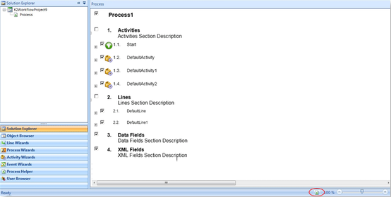
Document View: The document view enables you to view the workflow in a document outline style. Text can be added in this view but changes cannot be made to activities or events.
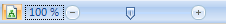
Zoom feature: Move the zoom selector to the left or right to decrease or increase the zoom view. This is especially helpful if you have a large workflow and want to adjust line or activity placement.
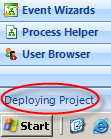
Deployment Status: The bottom left corner of K2 Studio shows the deployment status. This usually displays Ready, but during the deployment of a K2 process it displays the status of the deployment as well as the deployment result, such as Successful. Because K2 Studio does not have a confirmation dialogue that is displayed upon successful deployment, the status bar can be very useful to track the deployment progress and result.
Keyboard Short Cuts: Keyboard short cuts are available for most K2 functions on the Home and Process Bars.
 Mouse Gestures
Mouse gestures speed up the design process when building a process. When working in K2 Studio, you can draw certain letters on the design canvas while holding down the right mouse button and the designer will place certain controls on the canvas relevant to the letter that was drawn.
For example, drawing an A on the canvas inserts an activity onto the process design canvas. Once n activity is on the canvas you can draw on the activity object itself to specify event types for that particular activity. For example, if you draw an M on the activity, an email event is added to the activity.
Below is a list of commonly used mouse gestures:
- A, O – Create a Default Activity on the canvas
- M – Create an E-mail event
- Right-click canvas – Display the context menu
- Right-click activity – Display the activity context menu
- Right-click event – Display the event context menu
- Drag – Move an activity by clicking on the icon (located in the upper left corner of the activity object)
- Double-click on Activity/Event Icon – Run the Property Wizard for selected object
- Double-click on Activity/Event Name – Start editing the name
- Double-click on Activity Description – Start editing the description
- Scroll Wheel – Scroll the canvas up and down
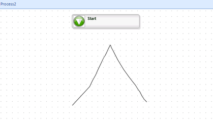
The following image demonstrates how a mouse gesture is drawn by creating an A on screen to insert an activity:
There are also some additional combination mouse and keyboard shortcuts available. Below is a partial list of some common combined items:
- CTRL + Click-Select – Clicked-on object will be added or removed from selection (toggle)
- CTRL + Scroll Wheel – Zoom in and out
- SHIFT + Mouse-Move – Holding the <SHIFT> key while moving the mouse over the Document View will show an insert location for a new line of text
- Click + Mouse-Move – Holding the <SHIFT> key while clicking the mouse left button over the Document View will add a new line of text at the indicated position
- CTRL + Drag – (from the appropriate location on an activity) Draw a line
Change Icon and Color
The color and icon of an activity can be customized to reflect the designer's preference. Right-click on the activity and select the option from the context menu.
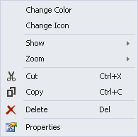
An illustration of customizing a client activity by changing its icon and color:
View
The view of a process, activity or event can be customized to reflect your preferences.
Grid
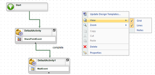
The grid, the background of the design canvas, can be customized by right-clicking on the canvas and selecting or de-selecting Grid.
When deselected, the blank canvas is displayed as shown:
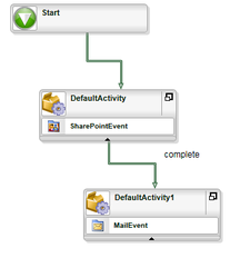
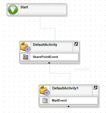
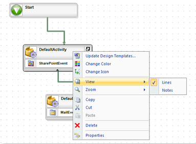
Lines
Lines can be customized on a process, activity or event level by right-clicking on the process, activity or event and selecting the option from the context menu.
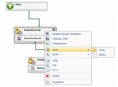
When de-selected, the lines are hidden as shown:
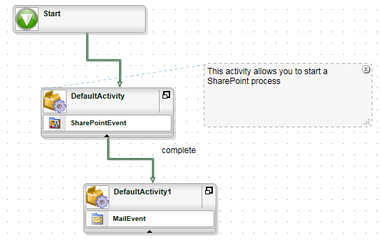
Notes
Notes can be customized on a process, activity or event level by right-clicking on the process, activity or event and selecting the option from the context menu.
When selected, the notes are displayed as shown. Notes can be added to, for example, provide comments for future reference, or to pass design information to another designer. You can drag the note around on the canvas or you can hide the note by deselecting Notes from the context menu.