Properties
The Properties tab contains properties for a control, view, or form that you can use to change how they look and behave.
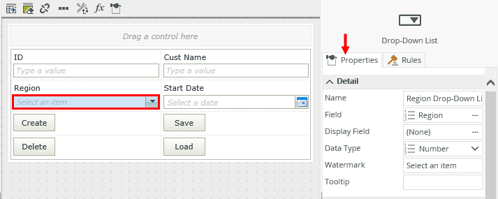
When you use fields, methods, or controls on a view or form, they contain properties that you can configure. See Controls for more information on these properties.

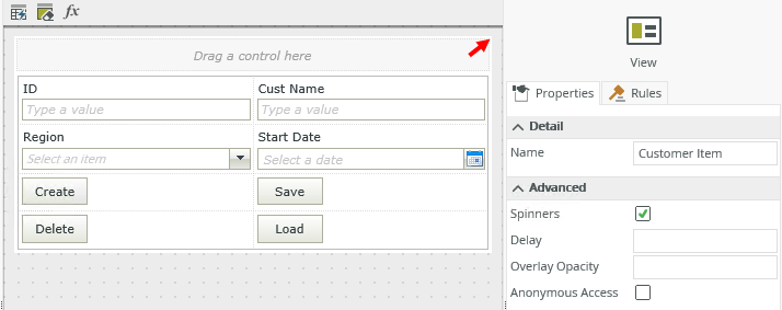
When you design a view, you can configure the properties of that view. Click the outline of the view in the designer to open the properties on the right.

| Properties | ||
|---|---|---|
| Feature | Description | How to use it |
| Name | Each view requires a unique name. This property is required and defaults to the name of the view. | Type a new name if necessary. |
| Spinners | Shows a spinner on the view while the view loads. This property is on by default. | Deselect the option if you do not want a spinner to display as the view is loading. |
| Delay | This is the delay, in milliseconds, before the spinner shows. If the Spinners property is on and the Delay property is 1000, then the spinner shows after a second. This is useful when the view takes less than the delay specified to load, but you want to show that it’s busy if it takes longer than expected. | Type a number in milliseconds. |
| Anonymous Access | Marks a view and form to be available anonymously. | Select the option if you want people to anonymously access the form. |
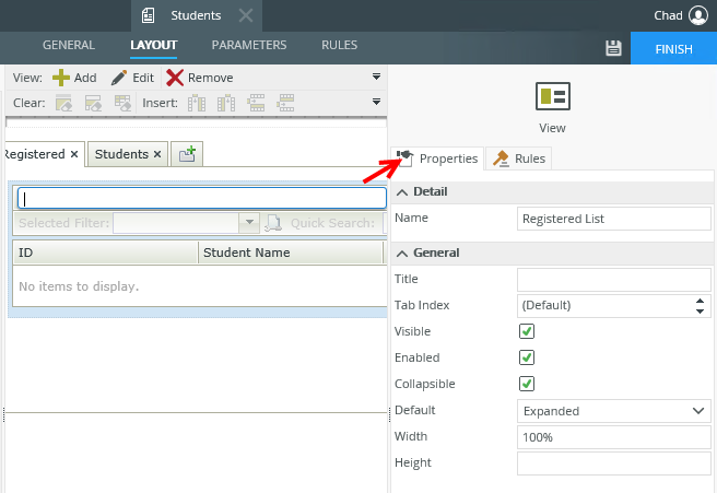
When you work with a view on a form, you can configure the view's properties on the form.
Click the view to open the view's properties.

| Properties | ||
|---|---|---|
| Feature | Description | How to use it |
| Name | Each view requires a unique name. This property is required and defaults to the name of the view. | Type a new name if necessary. |
| Tab Index |
Defines the sequence to follow when you use the Tab key to navigate through a page. |
Select the tab order. |
| Visible | Shows or hides the view. This property is selected by default. |
Select or deselect the option. |
| Enabled |
Enables or disables the view. If you disable the view, people cannot interact with it in runtime. This property is selected by default. |
Select or deselect the option. |
| Collapsible | Allows you to collapse the view. This property is selected by default. |
Select or deselect the option. |
| Default | This is the default setting to use when the form opens. Choose if the view must be collapsed or expanded on the form. | Select the option. |
| Width |
Adjusts the width of the view. You can enter any whole percentage up to 100%, whole number or pixel value to a maximum of 32767px. |
Type the dimension. |
| Height |
Adjusts the height of the view. You can enter any whole number or pixel value to a maximum of 32767px. When this property is set to zero, it automatically changes the size to fit the content of the page. |
Type the dimension. |
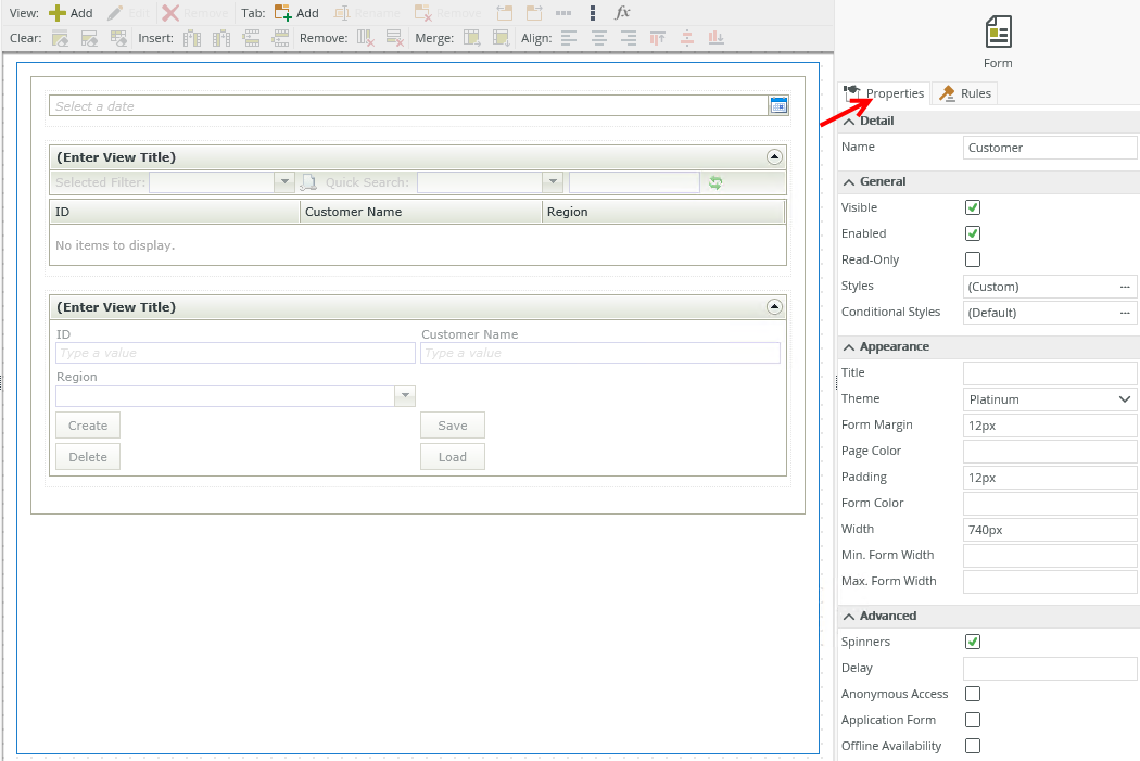
When you work with forms, you can configure the properties of the form.
Click the outline of the form in the designer to open the properties on the right.
| Properties | ||
|---|---|---|
| Feature | Description | How to use it |
| Name | Each form requires a unique name. This property is required and defaults to the name of the form. | Type a new name if necessary. |
| Visible | Shows or hides the form. The property is selected by default. |
Select or deselect the option. |
| Enabled |
Enables or disables the form. If you disable the form, people cannot interact with it in runtime. This property is selected by default. |
Select or deselect the option. |
| Read-Only | Shows the form as read-only. | Select the option. |
| Styles | Opens the Style Builder allowing you to specify style features like format, font, borders, padding and margins. See the Style Builder topic for more information on styling options. | No |
| Conditional Styles | Opens the Conditional Formatting page. You can design styles that apply only when certain conditions are met. See the Conditional Styles section for more information. Click the ellipsis to open the Conditional Formatting page. | No |
| Title | Specify the title to show at the top of the browser tab. | Type a title. |
| Theme | Choose a theme for your form. | Select a theme. |
| Form Margin | Adjusts the border size of the form. The default is 12px, but you can enter any whole number or pixel value to a maximum of 32767px. | Type a value. |
| Page Color | The color of the page. You can type text for the name of the color or the hexidecimal code of your color. | Type text or the hexidecimal code. |
| Padding | Padding controls the spacing between the contents of a form and the form's border. The default is 12px. | Type the number of pixels. |
| Form Color | The color of the form. You can type text for the name of the color or the hexidecimal code of your color. | Type text or the hexidecimal code. |
| Width |
Adjusts the width of the form. You can enter any whole percentage up to 100%, whole number, or pixel value (maximum of 32767px). |
Type the dimension. |
| Min Form Width |
The minimum width of the form. Use this to limit the minimum size of your form. |
Type the number of pixels. |
| Max Form Width |
The maximum width of the form. Use this to limit the maximum size of your form. |
Type the number of pixels. |
| Spinners | Shows a spinner on the form while the form loads. This property is on by default. | Deselect the option if a spinner should not be displayed. |
| Delay |
This is the delay, in milliseconds, before the spinner shows. If the Spinners property is on and the Delay property is 1000, then the spinner shows after a second. This is useful when the form takes less than the delay specified to load, but you want to show that it’s busy if it takes longer than expected. |
Type a number in milliseconds. |
| Anonymous Access | Marks a view and form to be available anonymously. | Select the option. |
| Application Form | Marks a form to be available in K2 mobile. | Select the option. |
| Offline Availability | Marks a form to be available offline in K2 mobile. | Select the option. |
- You cannot use rules to set the Advanced properties of a control, view, or form at runtime.
- The form's Spinners setting overrides the view's Spinners setting. View spinners only appear if the following conditions are true:
- The Spinners view property is selected.
- The Spinners form property is deselected on the form (parent) containing the view (child).
- The Spinners setting only applies to the initialize method, and displays when the view loads for the first time.
- If you add a control to a form, the form is the parent and the control is the child. If you select the Spinners property of the control and the form, the control's spinner does not display. If you configure a delay on the form's spinner or the spinner disappears while the control is busy, the control's spinner displays.
- If a form contains a view that has a control, the form is the parent to the view and the view is the parent to the control. The form's spinner overrides the other spinners. The view's spinner overrides the control's spinner.