Web Request
Use the Web Requestform control to get data from an external web service. The Web Request form control adds a field with a drop down list with data from the external web service to the form. Users of the form will be able to select a value to populate the field.
You can query a REST API by specifying the service URL, and retrieve data from a service. For example, retrieve information about Stephen King books using a public API for books. For an example, see Example - Retrieve information about books from an API.
Web Request control configuration settings
| Section | Setting | Description |
|---|---|---|
| (unlabeled) | Title |
Field title displayed on the published form. |
|
Customize |
Switch toggle to Yes to enable customization of the variable Name of the form control. |
|
|
Name |
(This field becomes configurable only when you switch the Customize toggle to Yes.) Customizes the name of the variable A placeholder that stores changes each time the workflow runs, such as the information entered in a form, or the name of a file. You can also create variables to store information you use in a workflow, such as an email address. for the field. If the name is not customized, the Title will be used as the variable name. |
|
| Service URL |
The URL of the RESTful API you want to retrieve data from. For example, http://openlibrary.org/search.json?author=stephen%20king |
|
| Request header |
HTTP header to be used in the request. The HTTP header does not relate to the content of the message and only provides additional information about the request to the server. It contains details of what information is needed from the server. The request header also contains the type, version and capabilities of the client that is making the request so that the server returns compatible data. The Request header has the following entered by default: Accept:application/json sets the output type to JSON. |
|
| Display type |
The display type for the published form. Select from one of the options:
|
|
| Response type |
The return data type from the external service.
|
|
| Label text |
The values to retrieve from the external service to display in the published form field. The label text controls what values are displayed in the form field for form users to see and select from. This field supports JSONpath syntax or XPath syntax depending on the Response type selected. Label text will be available as a form variable in the formula builder. For more information, see the example Example - Retrieve information about books from an API below. |
|
| Value text |
(Displayed only if Drop-down list is selected in the Display type field) Value to retrieve from the external service. Value text will be available as a form variable in the formula builder. This field supports JSONpath syntax or XPath syntax depending on the Response type selected. |
|
| Required |
Options to make the field a mandatory or optional field in the form. Select from the following options:
|
|
| Custom required message |
(Displays when you select Yes in Required) The validation text which displays below the field when a value is not entered into the field and the user attempts to change page or submit the form. |
|
| Visible |
Options to show or hide the field in the form.
|
|
| Read only |
Options to make the field Read-only. Yes: Displays the field on the published form but does not allow user input. No: Allows user input. |
|
| Placeholder |
Default text in the field of the published form. This default text disappears when the user types the first character in the field. |
|
| Description |
A description of the field to display below the field on the published form. |
|
| Tooltip | The message which appears when users hover their cursor or touch the information icon beside the field in the form. | |
| Shrink |
Reduces the width of the control when placed in a row with other form controls. |
|
|
Expand |
Increases the width of the control when placed in a row with other form controls. |
|
| Styling | CSS class |
Add a CSS class to apply a style to this form control. You can create the CSS class in the CSS code editor in form styles. Enter one class name or multiple class names separated by a space. For more information, see Add a custom CSS to individual controls. |
| Border color |
Border color to apply to the field. To select a color, click the color box and use the color picker to specify the color you want. You can click on the color map to select the color or enter the Hex code. To revert back to the global style, click Reset to global style. |
|
| Control fill |
The color to fill the inside of the field. To select a color, click the color box and use the color picker to specify the color you want. You can click on the color map to select the color or enter the Hex code. To revert back to the global style, click Reset to global style. |
|
| Control input color |
The font color of the input in the field. To select a color, click the color box and use the color picker to specify the color you want. You can click on the color map to select the color or enter the Hex code. To revert back to the global style, click Reset to global style. |
 Example - Retrieve information about books from an API
This example shows how to use JSONpath syntax to retrieve information from an API that looks up books and display book titles in a drop-down.
- Add the Web Request form control to the form designer and open the configuration panel.
- Fill the Title, Name fields. For more information about the fields, see Web Request control configuration settings.
- In the Service URL field, enter the URL to the RESTful API you want to retrieve data from. For this example, we use http://openlibrary.org/search.json?author=stephen%20king. This looks up Stephen King books and returns a list of books.
- In Request header keep the default value:
- Select Drop-down list in Display type.
- Select JSON as the Response type.
Accept:application/json
Part of the response received from the example API is given below:
Note: Only a small part of the response is used in this example to explain the values returned.
{
  "start": 0,
  "num_found": 1575,
  "numFound": 1575,
  "docs": [
    {
      "title_suggest": "Wizard and Glass",
      "edition_key":"OL20393754M",
      "cover_i": 8595436
    },
    {
      "title_suggest": "Misery",
      "edition_key":"OL10679349M",
      "cover_i": 8288254
    },
    {
      "title_suggest": "Carrie",
      "edition_key":"OL9779207M",
      "cover_i": 9834254
    }
  ]
}
In the above JSON response data the "title_suggest" property contains the book title values and the "edition_key" property contains the edition key number. For this example because we want to display the list of book titles in the form field for form users to select from, we use the "title_suggest" property to retrieve the book titles.
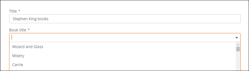
- To display the list of book titles in the form drop-down, type $.docs[*].title_suggest in the Label text field. The title of the book is retrieved and displayed in the drop-down as shown in the image below.
Note: The use of * selects and returns all elements in the docs array.
- In the Value text field, type $.docs[*].edition_key. The edition key value is retrieved and stored as a form variable in the formula builder.
As Label text field controls what data the form user sees in the form drop-down field, the options displayed in the drop-down will be the values of the "title_suggest" property. In this example the values Wizard and Glass, Misery and Carrie are displayed as options in the drop-down form field.