Filters
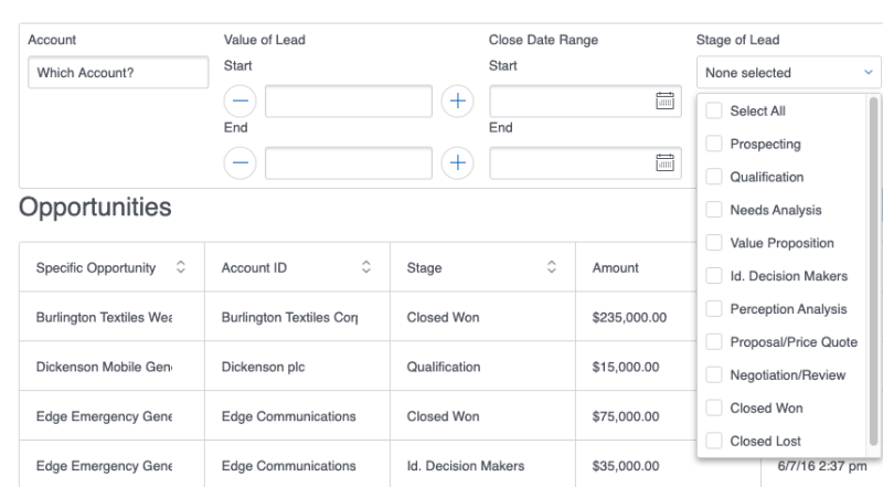
Building with Nintex Apps means presenting users with the right data, in the right format, at the right time. Thanks to Nintex Apps's powerful filter feature, it's also possible to give end users the ability to display only the data that is relevant to their current task. Users choose from a list of selectable criteria on the filter to find the precise records they need in the moment.

How Filters Work
Filters require two things to work: a condition and a filter element (such as a dropdown menu, toggle button, or autocomplete field) that can be used interactively by end users.
Conditions
Model conditions limit the records that are pulled into a model from a connection or other external system. They tell models which data to request (or not request) by checking the fields against criteria specified in the condition. In essence, model conditions filter content before it is pulled into the model. While model conditions are useful for the Nintex Apps builder to control what is pulled into the page, filters allow the builder to extend the power to "sift" data to the end users.
Filters operate by creating a model condition (or interacting with an existing one) to narrow the data pulled into a component. When a user interacts with the filter element in the component, it sets that condition's value. This, in turn, limits the data in the model and refreshes the data displayed within the component.
Some model conditions are created and configured manually by the builder, who determines how filters interact with those conditions. Others are auto-generated by Nintex Apps when a filter is created (if the filter property Pick options and conditions is set to Automatically ); these conditions cannot be edited by the builder.
To learn more about creating conditions, see Model Conditions.
Filter elements
Filters can be added to a page via the Filter Set component. The builder sets this component to filter a model, and it limits data on any component attached to that model.
Filters can also be added directly onto Table, Deck, and List components.
Conditionally render a filter
Filters added to components can be conditionally rendered using standard Display Logic options. For more information, see Display Logic.
Using Filters
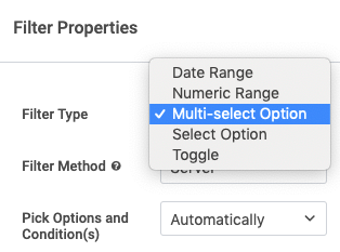
When creating a new filter, there are five different Filter type options:

- Date range: Filters to display items that fall within a selected date range.
- Numeric range: Filters to display items that fall within the designated numeric range.
- Multi-select option: Select more than one filter criteria; when activated, displays items that meet those criteria.
- Select option: Filters to display items that meet a specific filter criteria, such as a field value.
- Toggle: Filters to display item that meet specific criteria; operates as an on/off switch for rather than a set of selectable options.
For some filter types, you can select the source for the filter's user-selectable options, effects, and even manually create options for the list of filter choices.
For more on creating filters, see the Filter Set topic.
Best Practices
Condition Grouping Logic
If using grouping logic on the model's conditions, that logic must include the model conditions created (manually or automatically) for the filters. Even though these conditions are only executed when a filter is activated, they must be included in the grouping logic statement. If they are not included, Nintex Apps will ignore them completely, causing the filters to fail. Use AND statements to add the filter's model conditions to the grouping logic.
More than 25 values activates auto-completes
When using a Select option filter with the Pick options and conditions property set to Manually, if the filter has fewer than 25 options, they display as a dropdown list. However, if there are more than 25 options, the filter displays them via an autocomplete field (where a user starts typing and Nintex Apps generates a list of possibilities that match what's being typed). The user selects the appropriate option from the list.
To manually change when Nintex Apps switches from dropdown to autocomplete, use the Switch filter to autocomplete at X items property.
Note: If you pick a large number—such as 100—for this property, and the filter actually has many options, it may become impossible for users to navigate to the option they want. In general, it's best to keep the Switch filter to autocomplete at X items value lower, so users can leverage autocomplete to retrieve the desired value.
Filter Types—and When to Use Them
Nintex Apps offers a menu of different types of filters. To see examples of filters that you can use as templates, modifying to the needs of your users, visit our collection of Filter use cases:
Troubleshooting
Use the Web Developer Console to check any JavaScript errors.
To access the developer console:
- In Chrome: Right click anywhere on the page, then choose Inspect > Console.
- In Firefox: In the menu bar, click Tools > Web Developer.
To learn more about your browser's console in particular, see the links below:
If there's an error, the message may not provide information that's useful to you, but note if it includes the term Id in it. If so, your issue might be within the setup of the models.