Custom CSS Guidelines
You can follow the following guidelines when writing custom CSS in the code editor. Some examples and a list of recommended CSS classes to use are provided in this page.
Important: Applying custom CSS styles involves acceptance of potential risks, such as incompatibility with future form upgrades, interfering or conflicting with accessibility of the Forms or Nintex’s platform, and is excluded from Nintex support services.
To learn how to add a custom CSS to your form or individual form controls, see Add a custom CSS to your form.
 Video: Customize
 Apply styles at form level
This section provides CSS classes for styles you can apply at form level. Examples are provided with images of how it looks when the style is applied to the form.
Apply a style to the form
To apply styles to the form, use .nx-theme-form.
Important: .nx-theme-form must be added to all custom CSS code applied to a form.
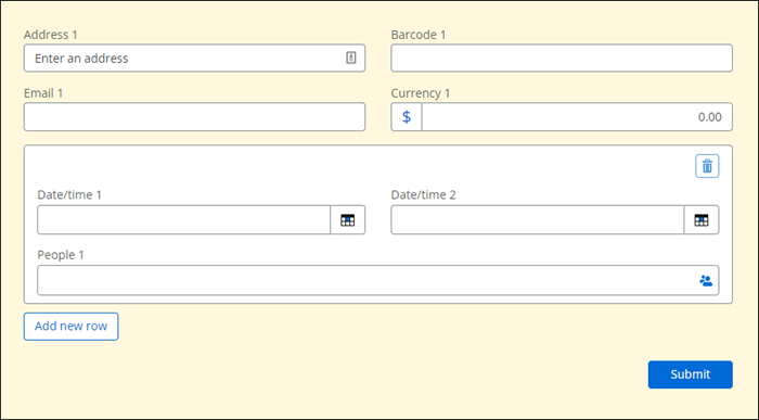
The following example is to change the background color of the form:
[dir] .nx-theme-styles .nx-theme-form {
	background-color: #FFF8DC;
}
Apply a style to the page
To apply styles to the form, use .nx-theme-page.
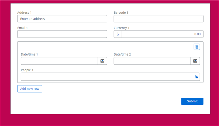
The following example shows is to change the background color of the page:
[dir] .nx-theme-styles .nx-theme-page {
  background-color: #bd0451;
}
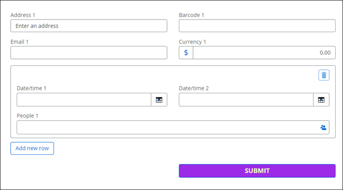
Apply a style to the Submit button
You can use the following to change the background color, font color, font size, width, and make the text uppercase and bold.
to select all primary buttons in the form, use CSS class .nx-theme-button-1
To target all secondary buttons, use CSS class .nx-theme-button-2.
[dir] .nx-theme-styles .nx-theme-form .nx-theme-button-1 {
  background-color: #9c2be7;
  color: #ebfdbf;
  font-size: 1.2em;
  text-transform: uppercase;
  font-weight: 700;
  width: 100%;
}
Apply styles to controls
This section provides CSS classes to apply to controls in the form. Examples are given with images of how it looks when applied to the form.
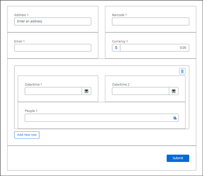
Apply a style to all controls
.form-group is the class for the main container that wraps the control and its label. Think of it as the highest layer of control.
The following example styles all group controls used in a form, by adding a border and increasing the space between any other controls around it.
[dir] .nx-theme-styles .nx-theme-form .form-group
  { padding: 30px; border: 1px solid #9d9d9d;
}
Apply a style to control labels
To select the control label, use CSS class .nx-theme-label-1.
The following example applies a style to control labels to align text to the right side, apply purple color, transforms to uppercase with underlines.
[dir] .nx-theme-styles .nx-theme-form .nx-theme-label-1 {
  text-align: right;
  color: #910adf;
  text-transform: uppercase;
  text-decoration: underline;
}

Apply styles to specific form controls
Styles you can apply to specific controls in the form.
Apply styles to all controls with text input
Use CSS class .nx-theme-input-1 to select all controls with text input.
The following code snippet shows how to change the background color and text color of the text inputs in the following controls:
-
Number control
-
Address control
-
Barcode control
-
Short text control
-
Long text control
-
Currency control
-
Email control
-
Geolocation control
-
Date time control
[dir] .nx-theme-styles .nx-theme-form .nx-theme-input-1 {
  background-color: #5f585f;
  color: #ffee00;
}

Short text controls
The following example shows how to apply a style to all the short text controls in a form:
[dir] .nx-theme-styles .nx-theme-form  ntx-textbox .nx-theme-input-1 {
  background-color: #5f585f;
  color: #ffee00;
}

To target only a certain control type, use ntx-<control_type_name>
Note: The ntx is without the dot, because it's an element and not a class name.
Following is a list of all control types/element names:
-
ntx-address
-
ntx-barcode
-
ntx-multichoice
-
ntx-choice
-
ntx-currency
-
ntx-data-lookup
-
ntx-datetime
-
ntx-email
-
ntx-file-upload
-
ntx-geolocation
-
ntx-group
-
ntx-image
-
ntx-richtext-label
-
ntx-number
-
ntx-people-picker
-
ntx-repeating-section
-
ntx-signature
-
ntx-space
-
ntx-multilinetext (Text – Long)
-
ntx-textbox (Text – Short)
-
ntx-boolean (Yes/no control)
Apply styles to a controls in a Repeating section or Group control
Text control in a Repeating control
The following example shows how to apply a style only to the Text - short control inside a Repeating section control:
[dir] .nx-theme-styles .nx-theme-form ntx-repeating-section ntx-textbox .nx-theme-input-1 {
  background-color: #464646;
  color: #b9ff50;
}

Text control in a Group control
The following example shows how to apply a style only to the Text - short control inside a Group control:
[dir] .nx-theme-styles .nx-theme-form ntx-group ntx-textbox .nx-theme-input-1 {
  background-color: #464646;
  color: #b9ff50;
}

Apply styles to a Repeating section
Use the following to target only the background of a repeating section:
[dir] .nx-theme-styles .nx-theme-form .nx-repeating-section-container
-
To add styling for the form only and exclude the repeating section control, the following is recommended:
[dir] .nx-theme-styles .nx-theme-form:not(.nx-repeating-section-container *) -
To add styling for the page only and exclude the repeating section control, the following is recommended:
[dir] .nx-theme-styles .nx-theme-page:not(.nx-repeating-section-container *)
Apply styles using custom CSS classes
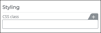
You can add a custom CSS class to a control you want by adding it to the CSS class field in the Styling section of the configuration panel.
You can achieve higher selector specificity by adding custom CSS classes. For more information about specificity see, this article.
Apply styles to a specific control using custom CSS classes
This is an easier way to select a specific control to apply a style. After you add a custom CSS class to a specific control in the CSS class configuration field, you can use it in CSS code as shown below:
[dir] .nx-theme-styles .custom-address label {
  color: #17a80b;
}

You can also add multiple CSS classes to the CSS class field of a control as shown below:
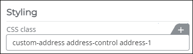
The example below uses these three custom CSS classes and applies a text color to all elements in the address control.
[dir] .nx-theme-styles .custom-address.address-control.address-1 * {
  color: #17a80b;
}

Apply styles to a group of controls
Custom CSS classes can be added to Group controls. In the following example, we have a set of controls for Participant 1 and another set of controls for Participant 2. For the four controls under Participant 1, add participant-1 in the Custom CSS class field in the configuration panel of the controls. For the four controls under Participant 2, add participant-2 in the Custom CSS class field in the configuration panel of the controls.
Example CSS code for Partcipant 1 and Participant 2 CSS class:
[dir] .nx-theme-styles .partcipant-1 label {
  color: #17a80b;
}
[dir] .nx-theme-styles .partcipant-2 label {
color: #d01717;
}

Using CSS classes in rules
Rules can be used to assign a style to a control depending on a specific condition. Given below are some examples of a CSS class being used in a form rule.
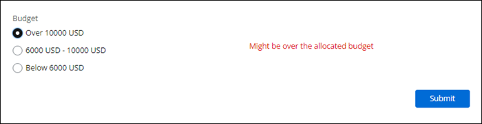
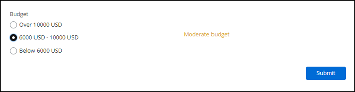
In these examples we add two rules to display a red alert or yellow alert in the form. Add a Choice - Single control to the form to select a budget amount and name it Budget. Then we use CSS classes to change the text displayed in a Label control based on the option selected in the Choice - Single control control.
Example 1:
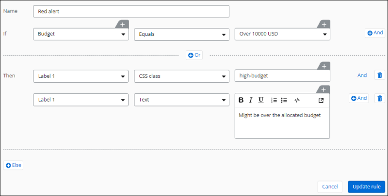
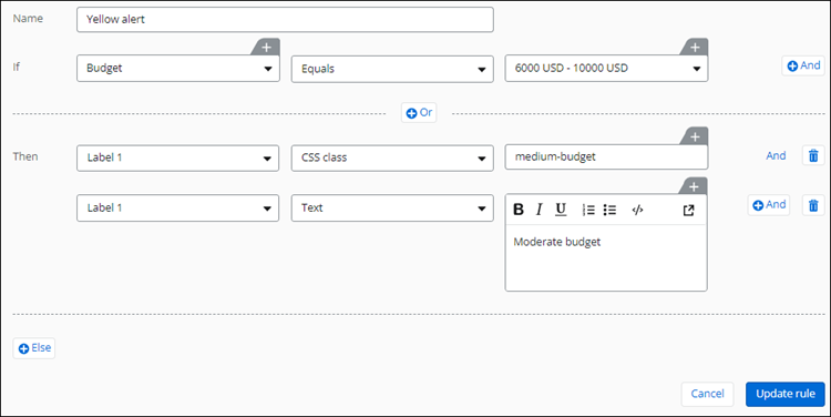
Now we can add CSS code to make use of the custom CSS classes that we setup in the above rules, to make the label text color red or yellow.
[dir] .nx-theme-styles ntx-richtext-label .high-budget .nx-theme-richtext p {
  color: #da0000;
}
[dir] .nx-theme-styles ntx-richtext-label .medium-budget .nx-theme-richtext p {
color: #daa520;
}The form preview for the above examples are shown below:
Create a header using CSS
The following example only works for a form that has multiple pages.
To add a header,
-
In the Form designer, click Configure pages.
-
In the Pages configuration panel, configure the Header text as required. You can add a logo image as well if required.
The following CSS sample does the following:
-
Fixes the height of the form and makes it scrollable within the form.
-
The header becomes sticky on top, and the z-index ensures that it's always stacked in front of other elements to avoid getting blocked.
Here is an example:
/* Fix the height of the form and make it scrollable within the form */
.nx-form.container-fluid.nx-theme-form {
  height: 700px;
  overflow: auto;
}
ntx-multi-page .nx-multi-page {
  position: relative;
}
/* Sticky Header */
.nx-multi-page-heading {
  position: sticky;
  top: -30px;
  z-index: 999;
  background-color: #ebe419;
}
