Using Style Properties with a Custom Control
SmartForms Style Properties can be added to a custom control. The following project outlines how to add and use these styles in a Custom Control project.
This project on Github contains the sample project described in this topic. You can view the project on Github instead of writing out the code, if you prefer:
K2Documentation.Samples.Extensions.SmartForms.CustomControl
Create a New Custom Control
- Create a new folder in your Visual Studio project. In this example we have called our folder 'WithStyles'.
- Create a new class file (Control.cs).
- Add the following sample code to the new class file:Copy
Sample class file
using System;
using System.Collections.Generic;
using System.Linq;
using System.Text;
using System.Web.UI;
// SourceCode namespaces used in the control
using SourceCode.Forms.Controls.Web.SDK;
using SourceCode.Forms.Controls.Web.SDK.Attributes;
// Point to the javascript file for the control
[assembly: WebResource("CustomControls.WithStyles.Script.js", "text/javascript", PerformSubstitution = true)]
namespace CustomControls.WithStyles
{
// Link to the definition file and the script file for the class
[ControlTypeDefinition("CustomControls.WithStyles.Definition.xml")]
[ClientScript("CustomControls.WithStyles.Script.js")]
public class ControlWithStyles : BaseControl
{
protected override void RenderContents(System.Web.UI.HtmlTextWriter writer)
{
writer.Write("ControlWithStyles");
}
}
}
The code references a control Definition.xml file and a JavaScript Script.js file that will be created in the following sections.
The ControlWithStyles class adds a RenderContents function to load a simple text writer.
Adding Styles to the Custom Control Definition.xml
- Add a new Definition.xml to the WithStyles project folder (make sure that you define the file as an embedded resource).
- Add the needed XML nodes to define the new custom control.
- Set up the basic ControlType values.
- Add a GetProperty and a SetProperty method.
- Add a Properties definition with a corresponding Styles section that defines the styles to be added to the control, using the sample code presented below, which shows the required SourceCode namespace to use for the DesignerSet of the property:Copy
Definition.xml
<?xml version="1.0" encoding="utf-8" ?>
<ControlType>
<FullName>CustomControls.WithStyles.ControlWithStyles, CustomControls</FullName>
<Category>Display</Category>
<Group>Custom</Group>
<Name>WithStyles</Name>
<DisplayName>Custom Control with Styles</DisplayName>
<GetPropertyMethod>CustomControls.WithStyles.getProperty</GetPropertyMethod>
<SetPropertyMethod>CustomControls.WithStyles.setProperty</SetPropertyMethod>
<Properties>
<PropID="Styles" setFunction="CustomControls.WithStyles.setStyles" friendlyname="Styles" type="complex" category="General" refreshdisplay="true"
DesignerSet="SourceCode.Forms.Designers.View.Styles._showEditStyles" />
</Properties>
<Styles>
<Style IsDefault="True">
<Font>
<Family/>
<Size/>
<Color/>
<Style/>
<Weight/>
</Font>
<BackgroundColor/>
<Text>
<Decoration/>
<Align/>
</Text>
</Style>
</Styles>
</ControlType>
Three basic style nodes are added to this example: Font, BackgroundColor and Text. More style definitions are listed in the final section of this topic.
Create the jQuery JavaScript functions to load the defined styles into a SmartForms View
- Add the Script.js to the WithStyles folder (make sure that you define the file as an embedded resource).
The following sample code demonstrates the setProperty and setStyles functions used to load the defined styles into the control rendering:
JavaScript setProperty and setStyles functions
// The following sample code demonstrates the setProperty and setStyles functions used
// to load the defined Styles into the control rendering.
(function ($, window, document, undefined) {
if (typeof CustomControls === "undefined" || CustomControls == null) CustomControls = {};
CustomControls.WithStyles = {
getProperty: function (objInfo) {
},
setProperty: function (objInfo) {
if (objInfo.property == "Style") {
CustomControls.WithStyles.setStyle(null, objInfo.Value, $('#' + ObjInfo.CurrentControlID));
}
},
setStyles: function (wrapper, styles, target) {
var isRuntime = (wrapper == null);
var options = {};
var element = isRuntime ? jQuery(target) : wrapper.find('.SFC.CustomControls-WithStyles-ControlWithStyles');
jQuery.extend(options, {
"border": element,
"background": element,
"margin": element,
"padding": element,
"font": element,
"horizontalAlign": element
});
StyleHelper.setStyles(options, styles);
}
};
}(jQuery, window, document));
The setStyles function uses the StyleHelper function of the Designer.
Now that all three parts of this custom control have been created, build the control, and use the controlutil.exe to register it.
Set the Styles of the custom control in a SmartForms View
- Create a new SmartForms View and load the new Custom Control With Styles control from the Custom node.
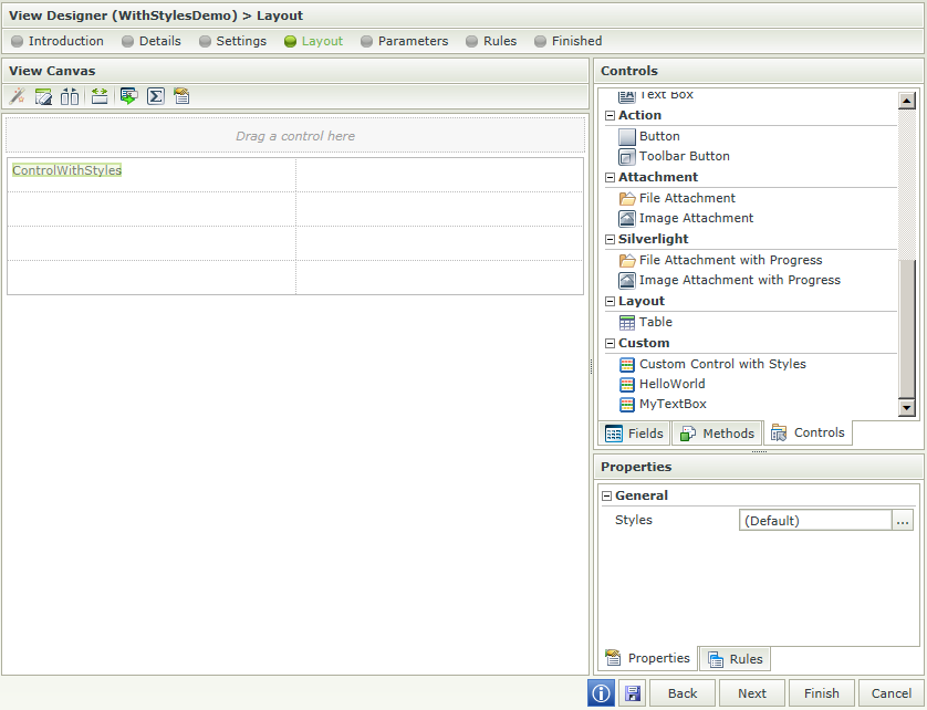
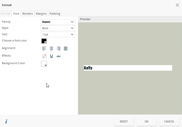
- In the Properties column, click on the ellipses button (...) to open the Format dialog.
- Configure the style of the text using the Font tab.
Standard Styles
The following XML shows the standard styles currently used by the Format dialog in the Designer:
Standard styles used by the Format dialog
<?xml version="1.0" encoding="utf-8" ?>
<!--The following XML shows the standard Styles options currently used by the Format dialog in the K2 Designer-->
<Styles>
<Style isDefault="True">
<Border>
<Default>
<Style/>
<Width/>
<Color/>
</Default>
<Right>
<Style/>
<Width/>
<Color/>
</Right>
<Left>
<Style/>
<Width/>
<Color/>
</Left>
<Top>
<Style/>
<Width/>
<Color/>
</Top>
<Bottom>
<Style/>
<Width/>
<Color/>
</Bottom>
</Border>
<Margin>
<Default/>
<Top/>
<Left/>
<Bottom/>
<Right/>
</Margin>
<Padding>
<Default/>
<Top/>
<Left/>
<Bottom/>
<Right/>
</Padding>
<Font>
<Family/>
<Size/>
<Color/>
<Style/>
<Weight/>
</Font>
<BackgroundColor/>
<Text>
<Decoration/>
<Align/>
</Text>
<Format/>
</Style>
</Styles>