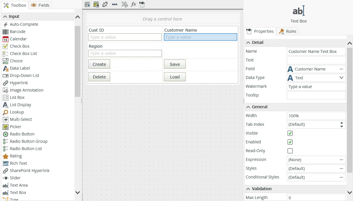
Text Box Control
The Text Box control allows you to enter a single line of text. You can use patterns to validate values that people type into the control.

- Create a view.
- Drag the control onto the canvas. You can find the control in the Input section of the Toolbox.
- Configure a validation pattern if necessary.
- Configure the rest of the properties as necessary.
- Run the view.
You can find the web.config files in the following locations:
"%ProgramFiles%\K2\K2 smartforms Designer\web.config"
"%ProgramFiles%\K2\K2 smartforms Runtime\web.config"
When you use Internet Explorer as your web browser and you configure a When [control] is Changed rule event, you can use the Enter key to execute the event. To do this, add the following to both web.config files in the appSettings node:
If the key entry is enabled in the Web.config file and you use an Editable List view, the Enter key does not commit the changes in the row but rather executes the When [control] is Changed rule event when the text box has focus.
You can find the control in the Input section of the Toolbox.
| Properties | Description | Can be set in runtime using rules? |
|---|---|---|
| Detail | ||
| Name | A unique identifier for the control. This property is required and defaults to the name of the control. | No |
| Text | Specify text to use when displaying the control at runtime, for example johndoe@companyname.com if an email address is required. | Yes, see Configure the Set a Control's Properties Action for more information. |
| Field | The field bound to the control. See the Binding Fields to Controls section for more information on how to use it. | No |
| Data Type | A drop-down list containing the types of values that the control can accept. | No |
| Watermark | Specify the text to display when the control is empty. | Yes, see Configure the Set a Control's Properties Action for more information. |
| Tooltip | The value to display when you hover over the control. | Yes, see Configure the Set a Control's Properties Action for more information. |
| General | ||
| Width | Adjusts the width of the control. You can enter any whole percentage up to 100%, whole number or pixel value to a maximum of 32767px. Type the dimension. | Yes, see Configure the Set a Control's Properties Action for more information. |
| Tab Index | Defines a sequence that users follow when they use the Tab key to navigate through a page at runtime. | Yes, see Configure the Set a Control's Properties Action for more information. |
| Visible | Shows or hides the control. | Yes, see Configure the Set a Control's Properties Action for more information. |
| Enabled | Enables or disables the control. If the control is disabled, you won't be able to use it. | Yes, see Configure the Set a Control's Properties Action for more information. |
| Read-Only | Shows the control as read-only. | Yes, see Configure the Set a Control's Properties Action for more information. |
| Expression | Opens the Expression Builder to configure expressions to populate the control with dynamically calculated values. | Yes, see Configure the Set a Control's Properties Action for more information. |
| Format | Opens the Format page where you can configure formatting and style features such as format, font, borders, padding and margins. See the Format topic for more information. | No |
| Conditional Format | Opens the Conditional Formatting page. You can add conditional formatting to apply a specific format or style when a condition you set is True. Use conditional format on its own or with the Format feature. See Conditional Format for more information. Click the ellipsis to open the Conditional Formatting page. | No |
| Max Length | The maximum number of characters that the control can accept. Type any value between 0 and 1000. | Yes, see Configure the Set a Control's Properties Action for more information. |
| Pattern | Patterns are regular expressions that you can use to enforce validation on the control. Click the ellipsis next to Pattern to configure a validation. | No |
| Message | Specify the message to display if the content of the control does not adhere to the pattern. | No |
The control interacts with other controls through rules. When you bind properties between different controls, you can use the data to populate properties or set values. Use the following examples for when to use the control with other controls through rules:
- Set a control’s properties: You can configure the settable properties of the control with this action
- Show/Hide: The Visible property allows you to show or hide the control through rules
- Enable/Disable: The Enabled property allows you to enable or disable the control through rules
- Data Transfer: You can transfer data from items listed in the context browser to the control
- Set Focus: You can use the Focus control method in the Rule Designer to set focus to the control in runtime
- The control is also available when designing forms
- You can use the Format tab of the Format page to format what people type into the control
- You can use the control with forms saved as a draft in the K2 Workspace (Mobile) app to save the data on the form to resume at a later point or to work on the form while offline. See How To: Configure Forms with Draft Functionality, Drafts in Android and Building SmartForms for Mobile Devices for more information on saving a form as a draft in the K2 Workspace (Mobile) apps.