Hyperlink Control
You can use the Hyperlink control to navigate to a URL. The control displays an HTML link to an address, which opens in the default browser. See Use SmartObject properties in a hyperlink expression to navigate to a URL for an example of creating a hyperlink expression that uses SmartObject properties for the expression parameters and assigning the expression to a hyperlink control.
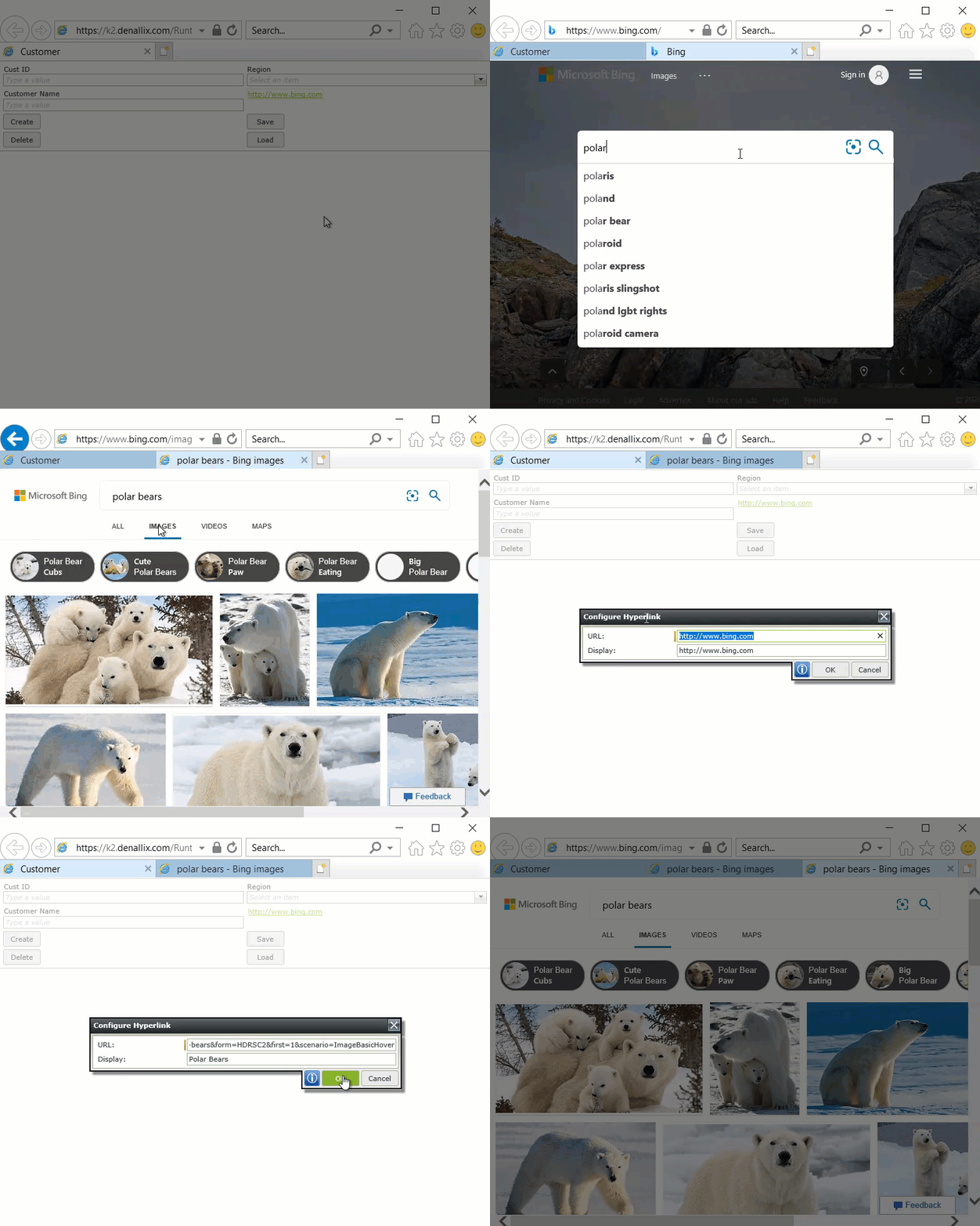
You have the option to change or delete the hyperlink when you run the view or form. To do this, disable the Read-Only property of the control, run the view or form, and hover over the hyperlink to see the edit and delete icons. When you click the edit icon, you can configure the URL and display of the hyperlink. When you run the view or form again, the URL and display values change back to the pre-configured values.
- Create a view.
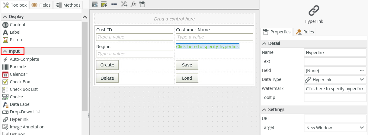
- Drag the control onto the canvas. You can find the control in the Input section of the Toolbox.
- Configure the URL in the control's Properties.
- Configure the Read-Only property if necessary.
- Configure the rest of the properties as necessary.
- Run the view.
You can find the control in the Input section of the Toolbox.
| Properties | Description | Can be set in runtime |
|---|---|---|
| Detail | ||
| Name | A unique identifier for the selected control. This property is required and defaults to the name of the control. |
|
| Text | The text to display in the control. If you leave this property blank, the URL or watermark displays. | Yes, see Configure the Set a Control's Properties Action for more information. |
| Field | The field bound to the control. See the Binding Fields to Controls section for more information on how to use it. | No |
| Data Type | A drop-down list containing the types of values that the control can accept. | No |
| Watermark | Specify the text to display when the control is empty. The text displays when the Read-Only property is disabled. | No |
| Tooltip |
The value to display when the cursor hovers over the control. |
Yes, see Configure the Set a Control's Properties Action for more information. |
| Settings | ||
| URL | Specify the URL to use for example http://www.bing.com/. The control accepts the following protocols:
|
Yes, see Configure the Set a Control's Properties Action for more information. |
| Target |
Specify the location of the page to open. The following options are available:
|
Yes, see Configure the Set a Control's Properties Action for more information. |
| General | ||
| Tab Index | Defines a sequence that users follow when they use the Tab key to navigate through a page at runtime. | Yes, see Configure the Set a Control's Properties Action for more information. |
| Visible | Shows or hides the control. | Yes, see Configure the Set a Control's Properties Action for more information. |
| Enabled | Enables or disables the control. | Yes, see Configure the Set a Control's Properties Action for more information. |
| Read-Only | Shows the control as read-only. Disable this property if you want to edit the hyperlink at runtime. | Yes, see Configure the Set a Control's Properties Action for more information. |
| Expression | Opens the Expression Builder to configure expressions to populate the control with dynamically calculated values. You can use this property to specify the display and URL dynamically | Yes, see Configure the Set a Control's Properties Action for more information. |
| Format | Opens the Format page where you can configure formatting and style features such as format, font, borders, padding and margins. See the Format topic for more information. | No |
| Conditional Format | Opens the Conditional Formatting page. You can add conditional formatting to apply a specific format or style when a condition you set is True. Use conditional format on its own or with the Format feature. See Conditional Format for more information. Click the ellipsis to open the Conditional Formatting page. | No |
The control interacts with other controls through rules. When you bind properties between different controls, you can use the data to populate properties or set values. Use the following examples for when to use the control with other controls through rules:
- Set a control’s properties: You can configure the settable properties of the control with this action
- Show/Hide: The Visible property allows you to show or hide the control through rules
- Enable/Disable: The Enabled property allows you to enable or disable the control through rules
- Data Transfer: You can transfer data from items listed in the context browser to the control or use a static (or dynamic) string in the following format:
- Navigate to URL: You can use this action to set up a URL using dynamic values
- Set Focus: You can use the Focus control method in the Rule Designer to set focus to the control in runtime