Workflow Instances Grid Control
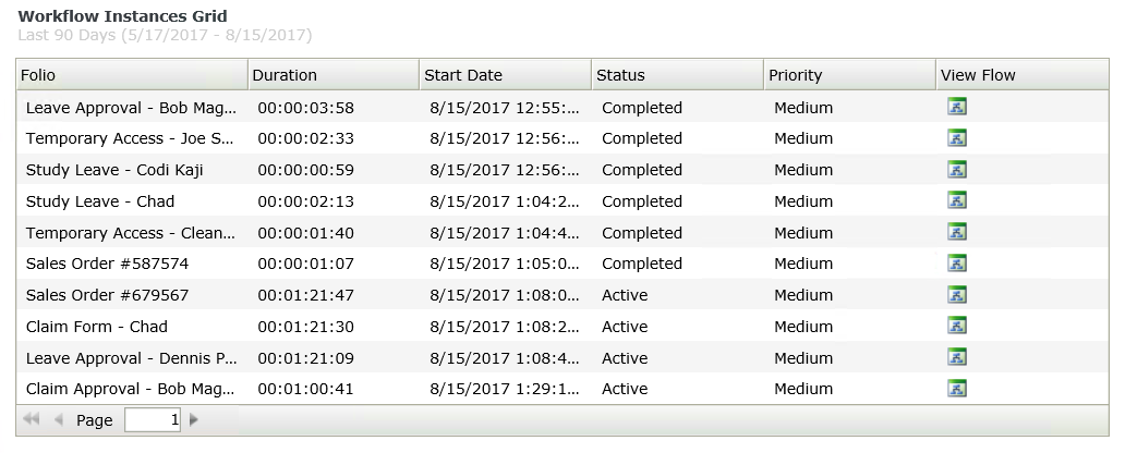
The Workflow Instances Grid control lists all workflow instances according to filter criteria, and is displayed as detailed information of a workflow instance or instances. You can use the grid to:
- Determine the priority and status of workflow instances
- Determine the start date of a specific workflow instance
- Identify a specific workflow instance if a unique folio is set during the workflow
- Open the View Flow of each workflow instance to view the color coded graphical representation of the workflow.
- Create a view.
- Drag the control onto the canvas. You can find the control in the Reports section of the Toolbox.
- Configure the properties of the control to display the data you want in the grid.
- Run the view.
You can find the control in the Reports section of the Toolbox.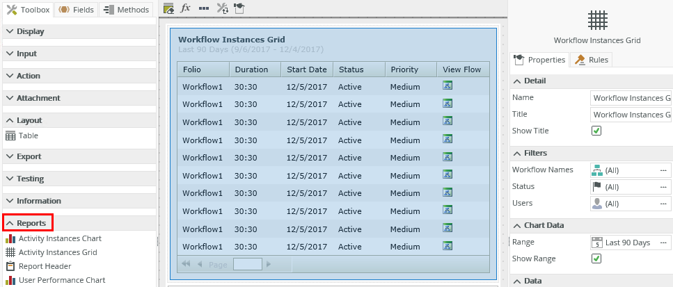
| Property | Description | Can be set in runtime using rules? |
|---|---|---|
| Detail | ||
| Name | A unique identifier for the selected control. This property is required and defaults to the name of the control. | No |
| Title | The title of the control. | Yes, see Control Properties Actions for more information. |
| Show Title | Shows or hides the title. | Yes, see Control Properties Actions for more information. |
| Filters | ||
| Workflow Names | This is the workflow on which you want to filter the data. If you select All, all workflow instances are shown. Click the ellipsis to use the Workflows Picker. You can add more than one workflow to the list. The default setting is All. | Yes, see Control Properties Actions for more information. |
| Status | You can select specific statuses of the workflow instance you want to filter. Click the ellipsis to use the Status Picker. The default setting is All. | Yes, see Control Properties Actions for more information. |
| Users | Select users who start or participate in a workflow instance. Click the ellipsis to use the Users Picker. | Yes, see Control Properties Actions for more information. |
| Chart Data | ||
| Range | The date range to use to filter the data. The data returned typically executes according to the date on which a workflow instance is started. Select a date range from the predefined drop-down list to filter. Click the ellipsis to use the Date Range Picker. | Yes, see Control Properties Actions for more information. |
| Show Range | Shows or hides the range. | Yes, see Control Properties Actions for more information. |
| Data | ||
| Visible Columns | You can select which columns are visible. Click the ellipsis then select the columns. | Yes, see Control Properties Actions for more information. |
| Participation | The participation type to use to filter the data. Use this type with the Users filter to refine the filter:
|
Yes, see Control Properties Actions for more information. |
| Initial Value | First record - You can choose if the first record returned on the list is selected when you use the Run Grid method of the control. This can be useful when you expect only one record to return and require no user interaction to select the record. If you select None, the first record is not automatically selected when the method executes. | Yes, see Control Properties Actions for more information. |
| Display | ||
| Sort by Default | Uses the default value of Date Started to sort the results. | No |
| Use Paging | Enables paging. If you do not select this option, all results return as one list. | Yes, see Control Properties Actions for more information. |
| Page size | You can specify the amount of records to show per page. The default is 10, but you can type any number. | Yes, see Control Properties Actions for more information. |
| General | ||
| Width | Adjusts the width of the control. You can enter any whole percentage up to 100%, whole number, or pixel value (maximum of 32767px). | Yes, see Control Properties Actions for more information. |
| Visible | Shows or hides the control. | Yes, see Control Properties Actions for more information. |
| Enabled | Enables or disables the control. If the control is disabled, you cannot interact with the control. | Yes, see Control Properties Actions for more information. |
| Read-Only | Shows the control as read-only. | Yes, see Control Properties Actions for more information. |
| Styles | Opens the Style Builder allowing you to specify style features like format, font, borders, padding and margins. See the Style Builder topic for more information on styling options. | No |
| Conditional Styles | Opens the Conditional Formatting page. You can design styles that apply only when certain conditions are met. See the Conditional Styles section for more information. Click the ellipsis to open the Conditional Formatting page. | No |
Report controls interact with each other through rules. When you bind properties between different controls, you can use the data to populate properties or set values. See the following points for using rules with control properties:
- When you use rules, you can use the control properties in the context browser for mapping to other controls. This means that you can drag the property from the control to another control’s properties or control value.
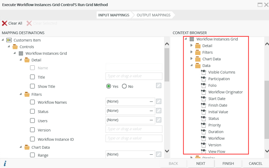
- You can use the following property as an input mapping property and
in the context browser when you use rules for mapping to other controls. This
property is additional to those mentioned in
the Properties
section of this topic, but is only available for interaction with rules:
Workflow Instance ID - Filters the grid based on a Workflow Instance ID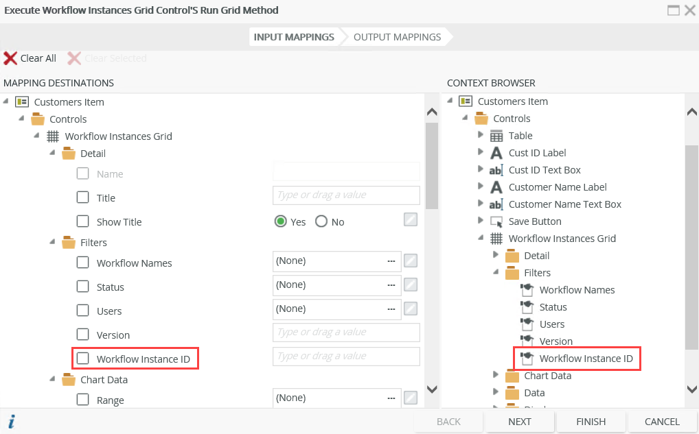
- You can configure a rule to use one grid control to populate another grid control, for example when you click a workflow in a Workflow Instances Grid, an Activity Instances Grid is populated. To do this, configure the following rule:

Map the Workflow Instances Grid to the Workflow Instance ID property of the Activity Instances Grid.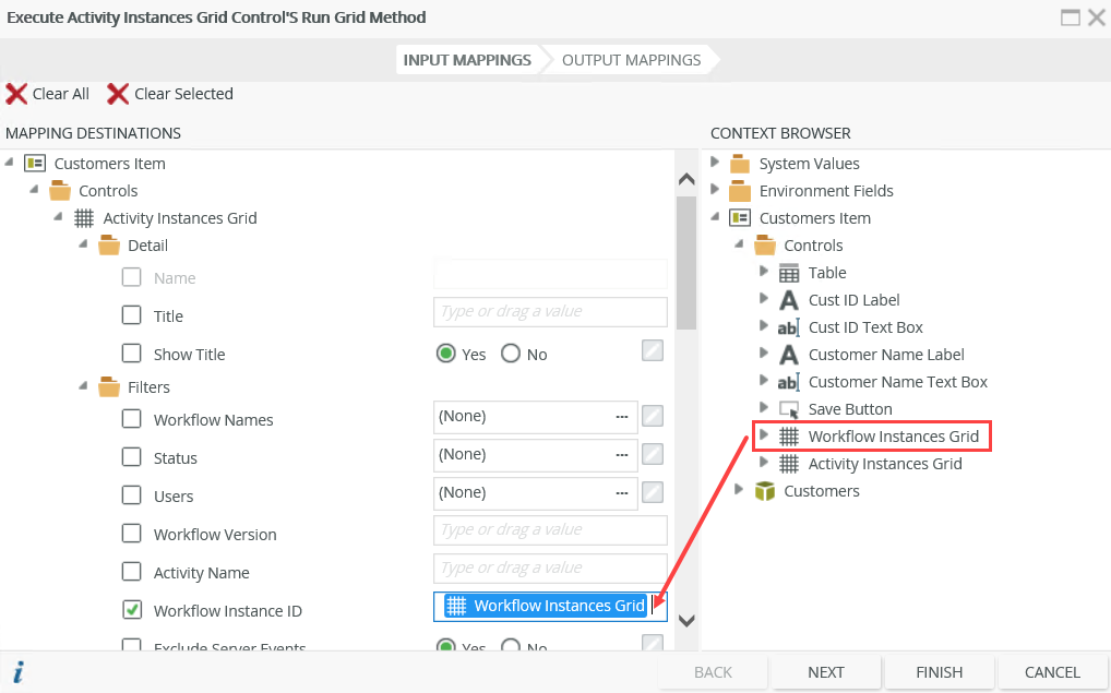
The following events and methods are available on the control:
Rule Events:
- When [control] is Changed: This event executes when the control is set to a new value that is different from the previous value. You can use this event to trigger actions when the control is changed, for example execute the Run method.
- When [control] is Populated: This event executes each time the control is loaded. You can execute a rule condition or action when the control is loaded, for example execute the Run method of another report control.
- When [control] is Clicked: You can execute a rule condition or action when the control is clicked, for example populate another control.
- When [control] is Double-Clicked: You can execute a rule condition or action when the control is double-clicked, for example populate another control or open a subview.
- When [control] is ViewFlow-Clicked: You can execute a rule condition or action when the View Flow icon of the control is clicked, for example open a subview.
Control Methods:
- Execute a control's Clear method: Clears the workflow data from the control. You can use this method to, for example, clear the workflow data and then execute a Run method using rule mappings of a different workflow.
- Execute a control's Run method: Gets the data from the database, applies configuration and rule settings, and then displays detailed information of all workflow instances.
Security on the Report controls ensures that the data is seen by only those who are authorized. Permissions are based on the process rights assigned to the process in Management Site:
- Admin or View permissions: You can access the Report controls.
- View Participate permissions: You can view the Report controls from the point where you are part of the workflow.
- The value of the grid is the selected instance. When you click a record in the grid in runtime, the value of the grid is the instance you select which you can use to bind properties or configure rules.
- When you use custom themes, be sure to specify the CSS classes for the elements.
- You cannot change the predefined grid control columns. However, you can deselect columns in the control's properties so that they do not display.
- You can use Report controls to access the data of workflows created in any workflow designer, including the K2 Designer and K2 Designer for SharePoint.