Control Tasks
The control tasks enable the developer to select the K2 data source and configure the Form's look and feel to meet the business requirements.
Standard Controls Tasks
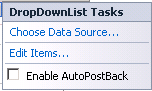
When certain of the Standard controls are dragged onto the design canvas the Tasks menu automatically displays to the right of the control. Below is an example of the DropDownList Tasks menu.
| Feature | What it is |
|---|---|
| Choose Data Source | Launches the Data Source Configuration Wizard which allows the developer to choose the K2 data source and then select a related SmartObject property |
| Edit Items | Launches the ListItem Collection Editor for the editing of the control properties |
| Enable AutoPostBack | Forces the control to post back each time an item is selected |
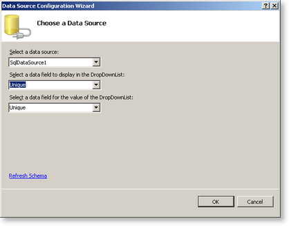
Data Source Configuration Wizard
| Feature | What it is |
|---|---|
| Select a data source | Select the K2 data source |
| Select a data field to display in the DropDownList | Select the SmartObject property to be associated with the DropDownList |
| Select a data field for the value of the DropDownList | Determines the SmartObject data that will be returned in the DropDownList |
Data Controls Tasks
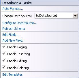
When certain of the Data controls are dragged onto the design canvas the Tasks menu automatically displays to the right of the control. Below is an example of the DetailsView Tasks menu.
| Feature | What it is |
|---|---|
| Auto Format | Allows the developer to change the format properties of the view by selecting from a list of existing schemes |
| Choose Data Source | Select the K2 data source from the drop-down list |
| Configure Data Source | Launches the Data Source Wizard to configure a new data source |
| Refresh Schema | TBA |
| Edit Fields | Allows the editing of data field properties such as style, appearance and behavior |
| Add New Field | Opens the Add field dialog box in which field types such as ButtonField can be associated with certain of the SmartObject properties and methods to create a new field on the form |
| Enable Paging | Adds a page number link to the bottom of the view. When in runtime the page numbers can be selected to display the next set of SmartObject data |
| Enable Inserting | Adds a New button or link to the view |
| Enable Editing | Adds an Editing button or link to the view |
| Enable Deleting | Adds a Delete button or link to the view |
| Edit Templates | Presents various templates that can be added to the view such as a page Header and Footer |
Edit Fields
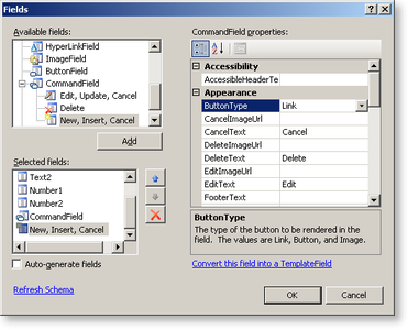
To change properties of the fields such as the style, color or appearance, select the required field and edit the properties that appear in the right-hand properties box.
| Feature | What it is |
|---|---|
| Available fields | Available fields display all fields that can be used in the view. Click the Add button to add the field to the selected fields. This will also add the field to the view in the design canvas |
| Selected fields | Displays the fields that are present in the current view |
| CommandField properties | Displays the selected field's properties. Clicking on the text box next to the property will either offer a drop-down list or allow the developer to type in text |
| Links | |
| Refresh Schema | Refreshes the schema for the data source |
| Convert this field into a TemplateField | Turns the current field type into a TemplateField |