How To: Configure cascading drop-down list controls
This topic explains how to configure cascading list controls. This example uses three drop-down list controls, where the list item selected in the first control acts as a filter for the list items displayed in the second control. The list item selected in the second control acts as a filter for the list items displayed in the third control.
Cascading drop-down list controls
Try it yourself!
Scenario
Your organization has a form requiring you to select a state, county, and city. You use cascading drop-down list controls for the location values. You configure the controls so that the county drop-down list displays values related to the state selected and the city drop-down list displays values related to the county selected.
Steps
In this scenario you build the following:
- Three SmartObjects to store information for states, counties, and cities.
- An editable list view to enter data for each SmartObject.
- An item view with three drop-down list controls configured to show cascading data.
You use views to create records for the cities, counties, and states in SmartObjects. The state SmartObject is the parent to the county SmartObject, while the county SmartObject is the parent to the city SmartObject. Each child SmartObject has a property that references a unique identifier in its parent SmartObject. It's this property that filters the list items displayed in the child controls.
Setup Steps
The following steps set up the scenario from start to finish. If you want to skip the setup steps and view the topic step, go to Configure the cascading drop-down list controls.
- From the Designer, create the SmartBox SmartObjects (and properties) listed below.
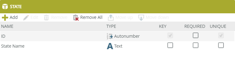
State: The State SmartObject stores a list of states. Property Name Data Type ID Autonumber State Name Text County: The County SmartObject stores a list of counties. You assign a State ID value from the State SmartObject to the StateID property in the County SmartObject. In this way, you can use the State ID property to filter the counties displayed in the drop-down list. Property Name Data Type ID Autonumber StateID Number County Name Text City: The City SmartObject stores a list of cities. You assign a County ID value from the County SmartObject to the CountyID property in the City SmartObject. In this way, you can use the County ID property to filter the cities displayed in the drop-down list. Property Name Data Type ID Autonumber CountyID Number City Name Text - In the Designer, create categories to keep your work organized (optional).
- Create the first SmartBox SmartObject and name it
State
then add the following property:
State Name (Text) - Your SmartObject should look like the image below. Click Finish to save and exit the SmartObject.
- Create the next SmartBox SmartObject and name it
County
then add the following properties:
StateID (Number)
County Name (Text)
Click Finish to save and exit the SmartObject.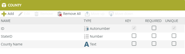
- Create the last SmartBox SmartObject and name it
City
then add the following properties:
CountyID (Number)
City Name (Text)
Click Finish to save and exit the SmartObject.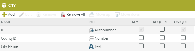
Now that you have your three SmartObjects, the next step is to add data. In the next step, you generate views based on each SmartObject, then use the views to add data.
- Generate an edible list view for the State, County and City SmartObjects (you are generating three views). After you generate the views, run each view and add records to each SmartObject. Remember that the StateID property in the County SmartObject must match an existing ID from the State SmartObject. The CountyID property in the City SmartObject must match an existing ID from the County SmartObject.
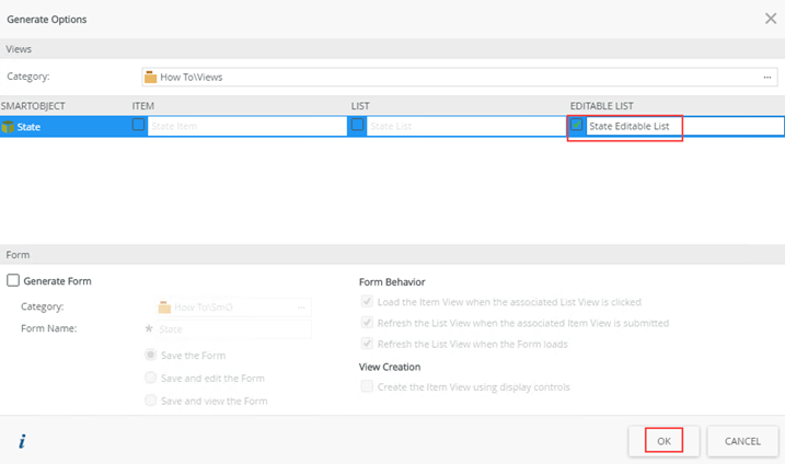
- Right-click the
State SmartObject and select
Generate Views.

- Check the box below
Editable List to create the
State Editable List view. Click
OK.
- Run the view by right-clicking it and selecting
Run.
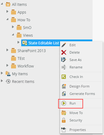
- The view opens in the central pane.
- Enter state records using the image below for reference. Click
Add and type a value in the
State Name field. The
ID field is automatically populated after you save your work. Click
Add again to add more items. Click
Save when you are done to save all the state entries.

- Generate editable list views for the County and City SmartObjects. Enter records for the
County and
City SmartObjects like you did for the
State SmartObject. Use the images below for reference. Be sure to enter the State ID and County ID values as shown so that you create a relationship between SmartObject records.
County editable list view
City editable list view
- Right-click the
State SmartObject and select
Generate Views.
Configure the cascading drop-down list controls
In this step you design a view with Drop-Down List controls for each of the State, County, and City SmartObjects. Then you configure the County and City controls to show data based on the State and County control values, respectively.
- In this step, you create an item view that you use to set up the cascading drop-down list controls. Right-click your category and select New View. Name the view Cascading Drop-Down Lists.
- In the Designer, right-click your category and select New View.
- Name the view
Cascading Drop-Down Lists
and confirm the view type is Item View. You do not need to set the data source. Click Create.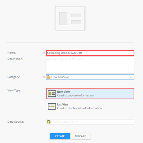
- In the Designer, right-click your category and select New View.
- Click Create Layout Table Only and set it for three columns and three rows.
Add a drop-down list control to each of the three cells in the second row. Rename each control as follows: Drop-Down State, Drop-Down County, and Drop-Down City. Add a label control to each of the three cells in the first row, then rename the labels to match their corresponding drop-down list controls: State, County, and City.
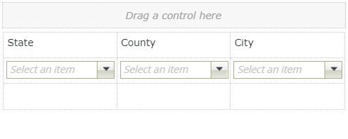
- Click Create Layout Table Only and set the layout for three columns and three rows. Click
OK.

- From the
Toolbox, drag a
Drop-Down List control into each of the three cells in the middle row. In the Properties pane on the right-side of your screen, change the Name for each control as follows:
Drop-Down State,
Drop-Down County, and
Drop-Down City.
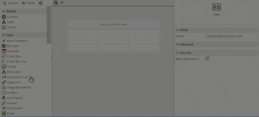
- Add labels for each column. Drag a
Label control from the Toolbox into each of the three cells in the first row. Change the
Name and
Text properties for each appropriately.

- Click Create Layout Table Only and set the layout for three columns and three rows. Click
OK.
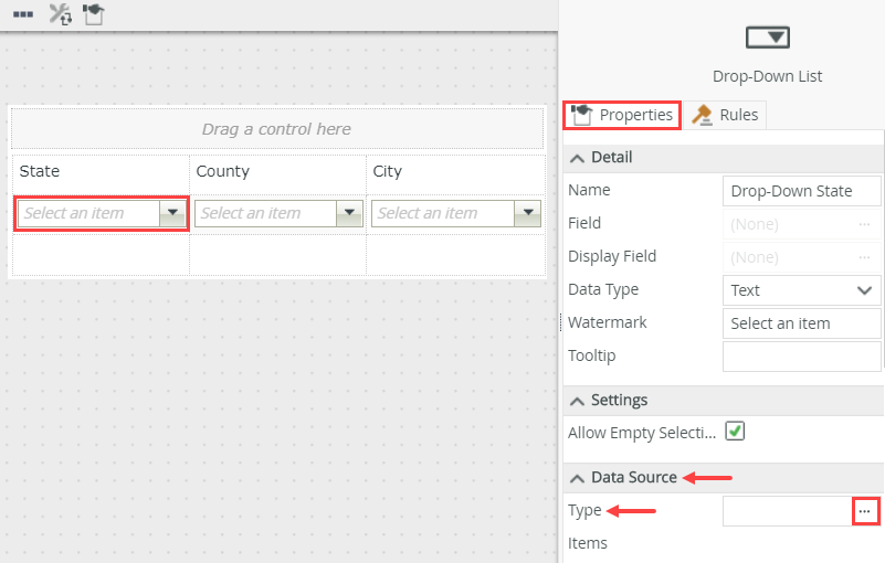
- Configure data sources for each drop-down list control using the table below for reference.
Control Notes Drop-Down State - Associate the control with the State SmartObject.
- Confirm the value is set to ID and the display is set to [State Name].
Drop-Down County - Associate the control with the County SmartObject.
- Confirm the value is set to ID and the display is set to [County Name].
- Enable filtering.
- Set the Parent Control to Drop-Down State.
- The Parent Join Property should default to ID.
- Set the Child Join Property to StateID.
Drop-Down City - Associate the control with the City SmartObject.
- Confirm the value is set to ID and the display is set to [City Name].
- Enable filtering.
- Set the Parent Control to Drop-Down County.
- The Parent Join Property should default to ID.
- Set the Child Join Property to CountyID.
- Next, you associate each drop-down list control with its corresponding data source, then configure filters to create the cascading effect. Select the Drop-Down State control, and click the
Type ellipsis under the
Data Source heading to open the data source editor.
- On the Configure Data Source screen, select the Use a SmartObject as data source option, then click the ellipses to set the SmartObject. Select State and click OK.
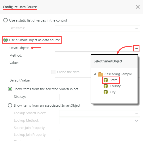
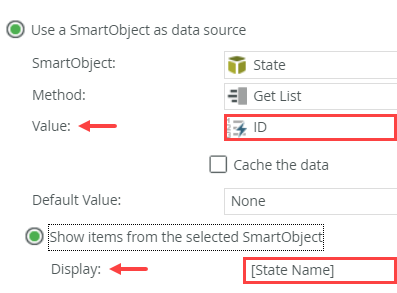
- Confirm Value defaults to ID and Display defaults to [State Name]. Click OK to save your data source settings.
- Select the Drop-Down County control and open the data source editor.
- Select the Use SmartObject as data source option, and select the County SmartObject. Confirm the value defaults to ID and the display defaults to [County Name]. Do not close this screen just yet.
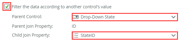
- Scroll down to the bottom of the screen and check the option to Filter the data according to another control's value. For the Parent Control, use the drop-down list to select the Drop-Down State control. (Remember, you want to filter the counties based on which state is selected.) The Parent Join Property automatically becomes the SmartObject's ID property, since this is the unique value for each record. For the Child Join Property, select StateID from the drop-down list. To recap, you are filtering the counties where the StateID value in the County SmartObject equals the ID value in the State SmartObject. Click OK.
- Select the Drop-Down City control and open the data source editor. Once again, select the Use a SmartObject as data source option and select the City SmartObject. Check the option to filter the records. For the Parent Control, select Drop-Down County. For the Child Join Property, select CountyID. Click OK.
- Click Finish to save and exit the view.
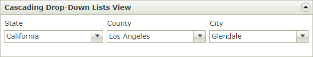
- Run the
Cascading Drop-Down Lists view. Select a state; the county control displays associated counties. Select a county; the city control displays associated cities.
- Right-click the
Cascading Drop-Down Lists view and select
Run.
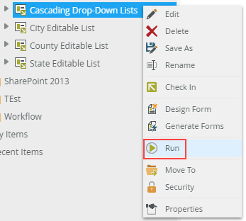
- Before you select a state, notice that the Drop-Down County and Drop-Down City controls do not display any list items. Select a state from the Drop-Down State control. You should see values in the Drop-Down County control. Select a county and confirm you see cities in the Drop-Down City control.
- Right-click the
Cascading Drop-Down Lists view and select
Run.
Review
Use the filter option when configuring a data source for a drop-down list control to limit the data shown in the control based on a selection in another control.