Plugin properties reference
Define these properties in your plugin to:
- Identify your plugin version and author.
- Control how your plugins look and behave when being configured.
- Add configuration and output fields to your plugins.
- Add events your plugins emit that can be used in Form rules.
Download and install the @nintex/form-plugin-contract npm package with the command npm install @nintex/form-plugin-contract.
Looking for examples? See our tutorials on some basic Example plugins.
Jump to:
Required properties
Make sure your plugin defines the following properties:
Plugin metadata
These properties define:
- Which version of the Forms Plugin API (the Forms Plugin contract) your plugin is using.
- The plugin author and version of the plugin.
Use these fields to keep track of updates to your plugin. You can view a plugin's source code in the plugin administration page to verify which version of your plugin your tenant is using.
| Property | Type | Required | Description |
|---|---|---|---|
|
version |
string |
Yes |
The Forms Plugin API version this plugin uses. This value is provided to you in the npm package. Note: You should not edit this value. |
|
pluginAuthor |
string |
- |
The author of the plugin. |
|
pluginVersion |
string |
- |
The plugin's version. |
Configuration fields
These properties define fields used to configure the plugin in the Form designer. There are standard fields that are common to all Form controls, and custom fields you can create.
Standard fields
Standard fields are common to all form controls, and are defined as boolean properties in the standardProperties object. Use the following properties to disable any configuration fields you want to remove from your plugin. Disabled fields do not appear in the Form designer configuration panel and cannot be used in rules.
Note: Defining a standard field as true does not set the field value to true. For example, setting readOnly to true does not make the plugin read only: it ensures the "read only" configuration field is available to the form designer.
Standard fields are enabled by default. You only need to define properties for fields you want to disable.
| Property | Type | Required | Description |
|---|---|---|---|
|
standardProperties.defaultValue |
boolean |
- |
Enable or disable a default value for the plugin's return value. |
|
standardProperties.description |
boolean |
- |
Enable or disable the field that allows designers to add descriptive text below the plugin on the Form canvas. |
|
standardProperties.fieldLabel |
boolean |
- |
Enable or disable the label that is displayed on the Form canvas for the plugin. |
|
standardProperties.placeholder |
boolean | - |
Enable or disable the ability to configure placeholder text in the plugin. This functionality must be implemented in your plugin. Form plugins does not provide default behavior for this property. See Add placeholder text. |
|
standardProperties.readOnly |
boolean |
- |
Enable or disable the ability to prevent end-users editing the value of this plugin when submitting a form. This functionality must be implemented in your plugin. Form plugins does not provide default behavior for this property. See Make your plugin read-only. |
|
standardProperties.required |
boolean |
- |
Enable or disable the ability to mark this plugin as required when a form is being submitted. |
|
standardProperties.toolTip |
boolean |
- |
Enable or disable the field that allows designers to define a tooltip to display when the plugin is rendered in the final form. |
|
standardProperties.visibility |
boolean |
- |
Enable or disable the ability to hide or display the plugin on the form canvas. |
Custom fields
Define custom fields that appear in the configuration panel in the Form designer.
Each custom field is defined as an object within the properties object. See Create a custom configuration field.
Note: Most examples in this documentation use the reactive properties feature of the Lit framework. When a property is reactive, as denoted by @property() , Lit creates a getter and setter pair for the property and schedules a DOM render whenever the property is changed. If you are not using Lit or a similar framework that offers this functionality and you want the plugin to update when properties are changed, you will need to implement this yourself. For more information on using Lit, see Get started with web components and Lit.
Custom fields data types
Custom fields must adhere to a data type. The data type determines how the field's value is treated by Form rules and variables. Some data types provide additional properties, like minimum or maximum values.
| Data type | Description | Additional properties | Example |
|---|---|---|---|
|
integer |
Whole number values |
minimum, maximum |
|
|
number |
Decimal values |
minimum, maximum |
|
|
string |
Text values |
minLength, maxLength |
|
|
boolean |
Boolean values |
- |
|
|
choice |
A string value selected from predefined options |
showAsRadio, verticalLayout, enum |
|
|
JavaScript object To define a data structure, add custom fields to a properties object in the object custom field definition. All properties in the data structure must be valid custom fields. Properties can be accessed in the plugin using standard dot notation: contactDetails.name. If an object custom field is designated as the value field, the defined fields are included in the plugin's output. Other form areas can access the fields using dot notation with the name of the control in the form design. For example, if the name of the plugin control in your form design is contact, the notation would be contact.name and contact.phone. For more information, see Form controls. Custom fields inside an object data structure cannot be designated as the value field. Only custom fields defined in the root level of the plugin's properties property can be designated as the value field. |
|
Custom field properties
| Property | Type | Required | Data types | Description |
|---|---|---|---|---|
|
type |
string |
Yes |
all |
The data type of the field. |
|
title |
string |
- |
all |
The label that appears above the field in the configuration panel. Use only letters, numbers, spaces, or quotation marks in this field. |
| required | boolean | - | all |
Set this property to true to flag this property as required. Required fields must be completed by the form designer when configuring the plugin. Note: This property only controls the required setting for the custom field when configuring the plugin. To enable the required configuration field that relates to submitting the form, see Standard fields. |
|
description |
string |
- |
all |
The description text that appears below the field in the configuration panel. Use only letters, numbers, spaces, or quotation marks in this field. |
|
format |
string |
- |
all |
An additional formatting type, similar to the format property in JSON schema. For example, email. |
|
defaultValue |
Must match property's data type |
- |
all |
The initial value for this field shown in the configuration panel. Use only letters, numbers, spaces, or quotation marks in this field. |
|
boolean |
- |
all |
Denotes this field as the value that is saved or submitted as the plugin's output value. The data type of this property determines the data type of the plugin. Only one field can be designated as the value field. If you need to submit information from multiple fields, consider using an object data type. Custom fields inside an object data structure cannot be designated as the value field. Only custom fields defined in the root level of the plugin's properties property can be designated as the value field. Note: Your plugin must emit a custom event named ntx-value-change to store a value. See Store a value in an output variable. |
|
|
mapsToAttribute |
string |
- |
all |
The data type this field should fallback to if the plugin does not load correctly. |
|
minimum |
number |
- |
integer, number |
The minimum allowed value for this field during configuration. This property does not automatically create runtime rules to validate a user-entered value. |
|
maximum |
number |
- |
integer, number |
The maximum allowed value for this field. This property does not automatically create runtime rules to validate a user-entered value. |
|
minLength |
number |
- |
string |
The minimum number of characters allowed for this field during configuration. This property does not automatically create runtime rules to validate a user-entered value. |
|
maxLength |
number |
- |
string |
The maximum number of characters allowed for this field during configuration. When this property is not defined, the default maximum length is 255 characters. Data beyond the maximum length of a custom field will be truncated. This property does not automatically create runtime rules to validate a user-entered value. |
|
enum |
Array<string> |
Yes (choice only) |
choice |
The list of allowed values. |
|
showAsRadio |
boolean |
- |
choice |
Set to true to show the choice as a set of radio options. Defaults to a drop-down list. |
|
verticalLayout |
boolean |
- |
choice |
Set to true to show the set of radio options in a vertical list. Defaults to displaying options next to each other. This property has no effect if showAsRadio is not set to true . |
| properties | object | - | object |
The data structure of an object data type custom field. All properties within this property must be valid custom fields. If the object custom field is designated as the value field, the defined fields are included in the plugin's output. See object data types. Custom fields inside an object data structure cannot be designated as the value field. Only custom fields defined in the root level of the plugin's properties property can be designated as the value field. |
Form designer appearance
These properties control how the plugin appears in the Form designer toolbox.
| Property | Type | Required | Description |
|---|---|---|---|
|
controlName |
string |
Yes |
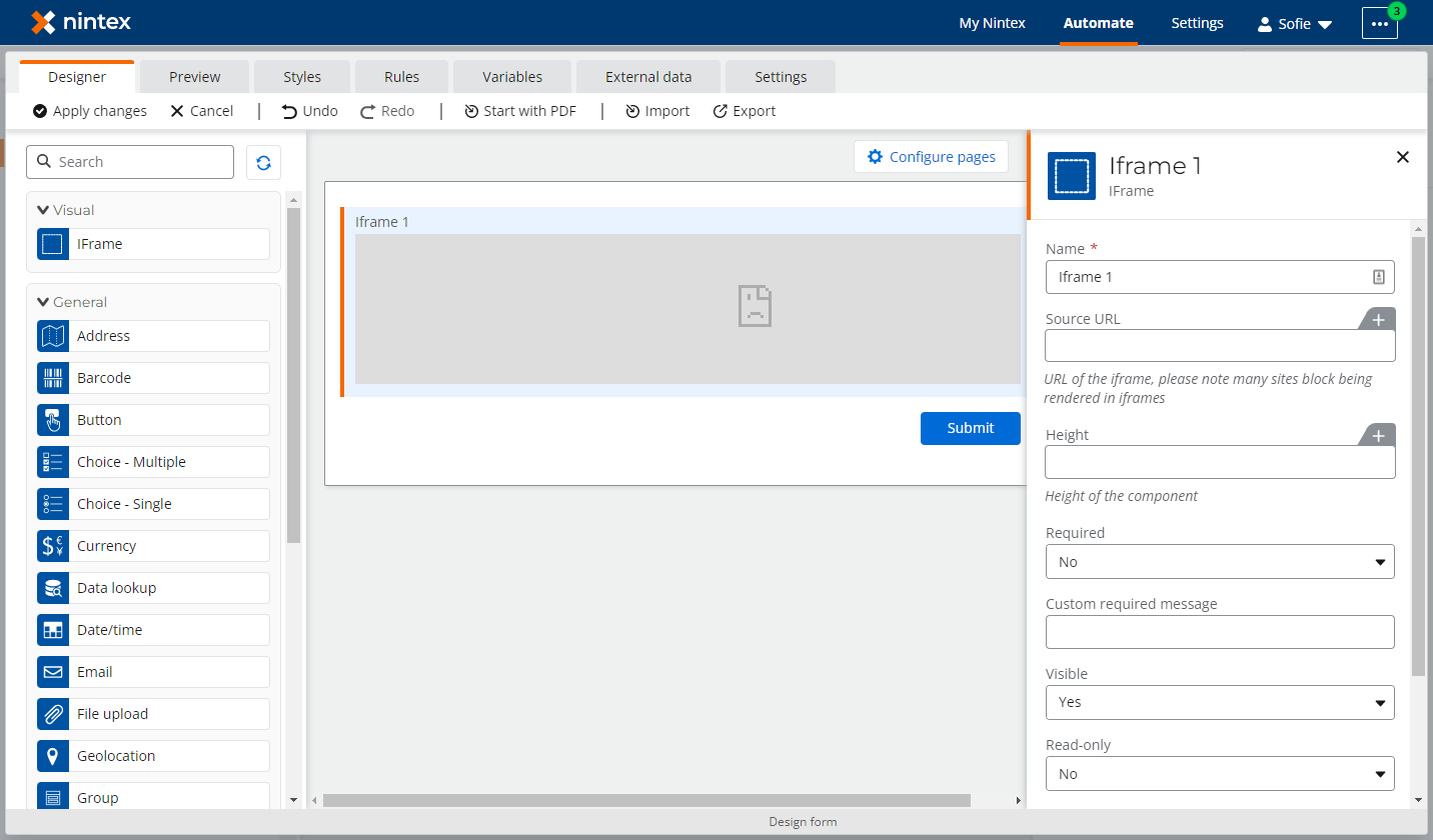
Name of the plugin shown in the Form Designer toolbox and below the plugin's title in the Form Designer configuration panel. |
|
description |
string |
- |
Text that appears in a tooltip for the plugin in the Form Designer toolbox. |
|
iconUrl |
string |
- |
The icon used for the plugin in the Form designer toolbox. This can be a URL or the Predefined icons for out-of-the-box form controls. If no name or URL is specified, a default plugin icon is used. |
|
groupName |
string or Object { name (string), order (number) } |
- |
Form control group the plugin appears in the Form designer. Use the order property to define the order plugins are shown in the group. |
|
searchTerms |
Array<string> |
- |
Keywords or search terms users may use to find this plugin in the Form designer toolbox. |
 Predefined icons
The predefined icons correspond to the out-of-the-box form controls:
- address-finder
- barcode
- multichoice
- choice
- currency
- data-lookup
- date-picker
- email-outline
- attach
- geolocation
- group-control
- image
- rich-text
- one-line-numbers
- users
- repeating-section
- signature
- space
- multiline-text
- one-line-text
Form designer behavior
This property controls how the plugin behaves when designing the form, such as which plugin fields can be altered by rules or variables.
| Property | Type | Required | Description |
|---|---|---|---|
|
designer.staticProperties |
Array<string> |
- |
Array of property identifiers that do not accept variables in the configuration panel and cannot be changed by rules. |
Form canvas appearance
The designer.canvasRestrictions object defines how your plugin behaves on the Forms canvas.
You can also use CSS variables and custom CSS to style your plugins. See Style plugins with CSS.
| Property | Type | Required | Description |
|---|---|---|---|
|
designer.canvasRestrictions.minSize |
number |
- |
The minimum size the plugin can be displayed in on the form. This is measured in grid units from 1 to 12. For example, a minSize of 6 means the plugin requires at least half a row. This property is ignored if isFullRow is true. |
|
designer.canvasRestrictions.isFullRow |
boolean |
- |
If true, this plugin always uses a full row in the form canvas. |
Events
To store a value, form plugins must emit a custom event called ntx-value-change to notify the form that their value has changed and should be stored.
Your plugin can also emit custom events for other changes, such as when an external API call has returned a response, or a calculated value is within a valid range. Form designers may use these events to create Form rules for the plugin, or for other form controls in the same form.
To make these custom events available to Form rules and formulas, define each custom event name in the events array at the root level. The event names must match the name of the custom events emitted by your plugin. Only the ntx-value-change event and events that are defined in the events array will be available in the Form rules and formulas.
| Property | Type | Required | Description |
|---|---|---|---|
|
events |
Array<string> |
- |
Array of event names that your plugin may emit. |
Note: ntx-value-change is a special event name reserved for notifying the form that the plugin's value has changed and should be stored. Provided your plugin has defined a custom field to store the value, the value is automatically stored when your plugin code emits the event. The ntx-value-change event is automatically available to Form rules and formulas and does not need to be added to the events array. See Store a value in an output variable.
Fallback behavior
| Property | Type | Required | Description |
|---|---|---|---|
|
fallbackDisableSubmit |
boolean |
Yes |
If true, the form submit button will be disabled if this plugin fails to render properly. |
Note: If your plugin fails to load from your hosting provider, this fallback property will not be read, and your submit button will not be disabled.