Table Control
The Table control is a layout control used to adjust the layout of controls. The Table control enables the user to create a table, specifying the number of rows and columns. When dragging a Field of type Table onto the canvas, the properties displayed will be specific to that Field.
- Create a View
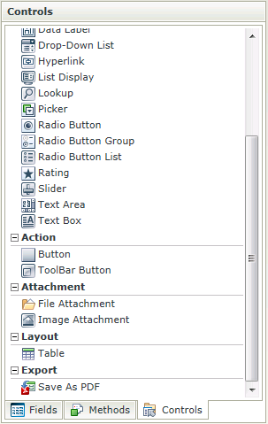
- Drag the Table control onto the canvas. The control can be found in the Layout section of the Controls found in the View Designer, see the Properties section below
- Specify the number of columns and rows to be used
- Configure controls in the cells of the table
- Configure the properties of the controls as required
- Configure rules as required
- Run the View
- The Table control is also available in the Form Designer
- The Table control is not rendered during runtime
- The Table control can be used in conjunction with the following Rule Actions to :
- hide/show controls - Show a Control,Hide a Control
- enable/disable controls - Enable a Control, Disable a Control
- to make controls read-only / editable - Specify Edit State for Controls
The Table control is available in the Layout section of the Controls found in the View Designer and Form Designer.

| Properties | Description | Can be set in runtime using Rules |
|---|---|---|
| Name | A unique identifier for the selected control. This property is required | No |
| Visible | A Boolean value used to establish whether the control is visible during runtime | Yes, see Control Properties Actions for more information |
| Enabled | A Boolean value used to establish whether the control is enabled during runtime | Yes, see Control Properties Actions for more information |
| Read-Only | A Boolean value used to establish whether the control is read-only during runtime | Yes, see Control Properties Actions for more information |
| Width | Adjust the width of the control (any whole percentage up to 100%, number or pixel value up to 32767px) | Yes, see Control Properties Actions for more information |
Tip when working with a table cell and styling
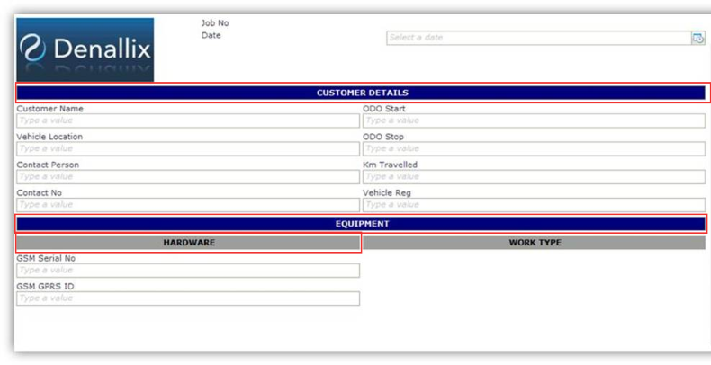
When working with a table and a cell requires styling such as background color etc, the Text Box control can be used to apply styling or set other properties which will in turn apply to the cell. In the example below the Text Box control's width is set to 100%, it is configured as Read-Only and styling is applied. All of these properties are applied to the cell.

