List Display Control
When dragging a Field of type List Display onto the canvas, the properties displayed will be specific to that Field. A List Display needs to be bound to a SmartObject containing an association to another SmartObject. To populate a List Display a transfer data Rule action has to be configured to pass the relevant value to the List Display.
- Create a View
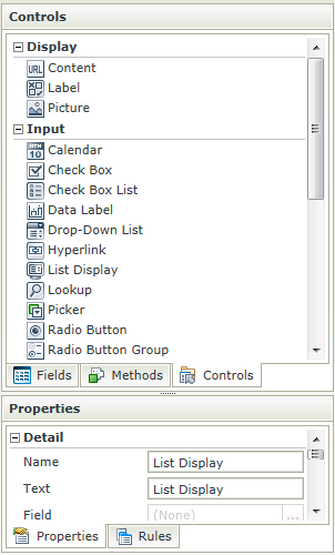
- Drag the List Display control onto the canvas. The control can be found in the Input section of the Controls found in the View Designer, see the Properties section below
- Configure the SmartObject under Data Source of the Properties section, see Considerations
- Configure the rest of the properties as required
- Configure a transfer data rule action to pass the value to the List Display control, see Considerations. For example, in the Runtime Example above, a rule has been configured to transfer the value of the Region Drop-Down List control when the control is changed to the List Display control
- Run the View
- The List Display has to be bound to a SmartObject with an association
- To populate a List Display a transfer data action has to be configured to pass the relevant value (should be the associated property) to the List Display
The List Display control is available in the Input section of the Controls found in the View Designer and Form Designer.

| Properties | Description | Can be set in runtime using Rules |
|---|---|---|
| Name | A unique identifier for the selected control. This property is required | No |
| Field | A read-only property displaying the field that is bound to the selected control | No |
| Data Type | A drop-down list containing the types of values that the selected control can accept | No |
| Tooltip | The value to be displayed when the cursor is hovered over the control during runtime | Yes, see Control Properties Actions for more information |
| Text | The text to be displayed during runtime. | Yes, see Control Properties Actions for more information |
| SmartObject | The SmartObject that has been selected | No |
| Method | The method to be used to populate the control | No |
| Value | The SmartObject property that will be used as the selected value of the control | No |
| Lookup SmartObject | An alternate SmartObject to be used as the source of the display values (*optional) | No |
| Lookup Method | The method to be executed on the lookup SmartObject when retrieving the display values | No |
| Source Join Property | The SmartObject property on the lookup SmartObject that will be used to join the original SmartObject with the Lookup SmartObject | No |
| Lookup Join Property | The SmartObject property on the lookup SmartObject that will be used to join the original SmartObject with the Lookup SmartObject | No |
| Display | The display template of the control, indicating what values are visible when populating | No |
| Width |
Adjust the width of the control (any whole percentage up to 100%, number or pixel value up to 32767px). Note: The Width should be set when using the Wrap Text property. |
Yes, see Control Properties Actions for more information |
| Visible | A Boolean value used to establish whether the control is visible during runtime | Yes, see Control Properties Actions for more information |
| Enabled | A Boolean value used to establish whether the control is enabled during runtime | Yes, see Control Properties Actions for more information |
| Wrap Text | Allows the user to set the Width of the control and if the Text of the Label is longer than the label, the Wrap Text property can be selected to allow the overflow to flow to new lines, growing the Label height. If the Width is set and the Text content runs longer than the Label width, the overflow is hidden and an ellipsis is shown. In runtime, if the Tooltip is set and the content is hidden, the Tooltip shows the full text | Yes, see Control Properties Actions for more information |
| Literal | A Boolean value used to establish whether the text should be read as literal or plain text. In the following example: <div style=”color:blue”>HTML Element</div> If Literal = True, the result will be: HTML Element If Literal = False, the result will be: <div style=”color:blue”>HTML Element</div> The setting is disabled by default. If Literal is not selected, the control does not add any HTML elements to the text. This is useful when you want to render text and controls directly into a page without any additional markup |
Yes, see Control Properties Actions for more information |
| Styles | Opens the Style Builder enabling the user to specify style features like Format, Font, Borders, Padding and Margins. See the Style Builder topic for more information on styling options | No |
| Conditional Styles | Opens the Conditional Formatting Designer used to design styles that will apply only when certain conditions are met See the Conditional Styles section for more information | No |
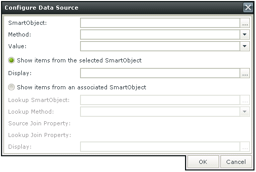
Configure Data Source
When clicking on the ellipsis next to SmartObject, the Configure Data Source screen opens. Configure the data source to be used

| Fields | Description |
|---|---|
| SmartObject | The SmartObject that has been selected |
| Method | The method to be used to populate the control |
| Value | The SmartObject property that will be used as the selected value of the control |
| Show items from the selected SmartObject | Shows items from the selected SmartObject |
| Display | The display template of the control, indicating what values are visible when populating |
| Show items from an associated SmartObject | Shows items from an associated SmartObject |
| Lookup SmartObject | An alternate SmartObject to be used as the source of the display values (*optional) |
| Lookup Method | The method to be executed on the lookup SmartObject when retrieving the display values |
| Source Join Property | The SmartObject property on the original SmartObject that will be used to join the original SmartObject with the Lookup SmartObject |
| Lookup Join Property | The SmartObject property on the lookup SmartObject that will be used to join the original SmartObject with the Lookup SmartObject |
| Display | The display template of the control, indicating what values are visible when populating |
For-Each looping rule conditions are available for use on List Views and list controls. For more information see the Rule Conditions topic.
How to use rules to change the edit state of View and Form controls and tables
