Editable List View
The Editable List View presents the user with the functionality to create a View that will be used to edit lists of information. The Layout functionality of the Editable List is exactly the same as the List View Layout with one addition:
- The Add/Edit Item section - Each control represents the data type of the control listed in the columns above. The control properties can be configured by selecting the controls and changing the configuration on the right in the Properties panel
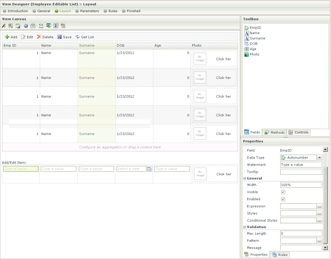
See the List View Layout topic for more information on this feature.
When designing a View and clicking on the Create Labels and Controls toolbar button, the View that was designed will be lost and the View will reset to the selection on the Create Labels and Controls screen. To preserve the already designed View, Save or Finish the View. The Create Labels and Controls button can then be executed and if not satisfied with the results, Cancel to revert back to the saved version.
The List View settings can be set by clicking the settings icon in the toolbar:
![]()
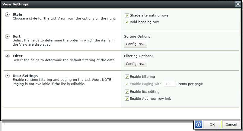
| Feature | Description | How to use it |
|---|---|---|
| Style | Enables styling | Select the options required |
| Sort | Provides sort options | Click on Configure and select up to a maximum of two fields to determine the order in which the items are displayed in the view |
| Filter | Provides filter options | Click on Configure and select up to a maximum of two fields to determine the default filtering of the data |
| User Settings | Enables runtime filtering and paging. Paging is not available if the list is editable | Select the options required and specify the number of items if required |
For more information on the View Settings, see the List View Layout topic.
Columns can be added by dragging Fields or Controls onto the canvas.
- Edit a List View or Editable List View.
- Drag a field or control onto the canvas.
- Wait for the drop zone to be displayed, then drop the field or
control where required.
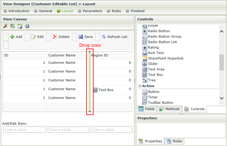
- Note that the column is configured according to the type of field or control.
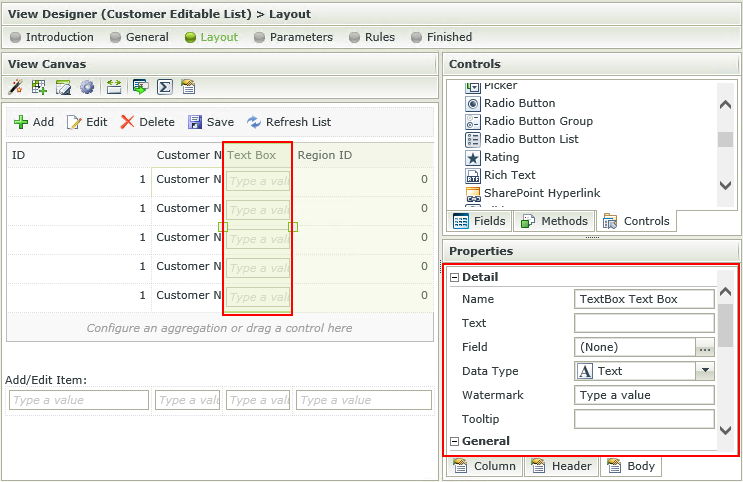
- Fields and controls can also be dragged and dropped directly onto the canvas when creating a new View. It is not necessary to configure the View layout first.
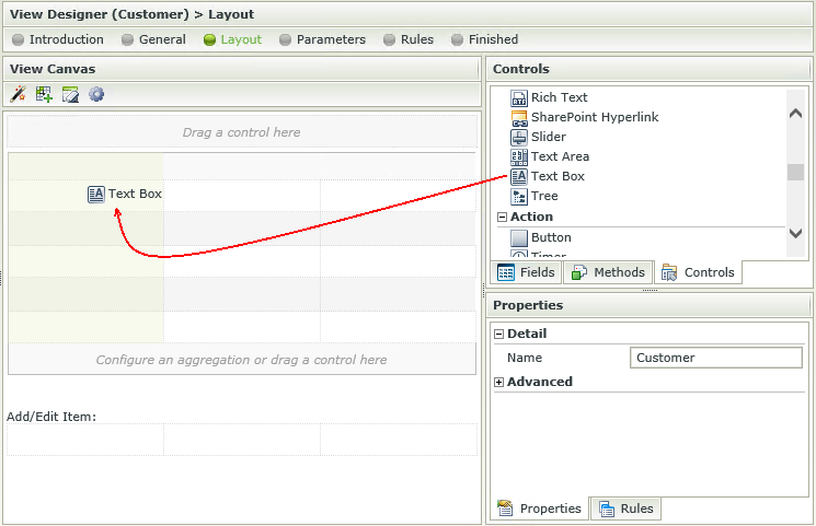
When a control is dragged from the Toolbox of a View, it is bound to that SmartObject property. When using the same control more than once on a View, all of those controls stay bound to that property unless you specifically unbind the control. Controls can be unbound by selecting the control and clicking on the Unbind button in the canvas Toolbar. When one of the controls bound to the property is updated, all of the related controls linked to that property will be updated as well.
It is therefore important to note that when using the dependent drop down scenario on a List View for example, one needs to unbind the parent controls from the foreign keys that were originally dragged upon the canvas. When one drop down changes, it applies the change to the next control, which is bound to the same field, and will attempt to update all the related controls. This will cause a repeating cycle of events.
This is also applicable if a foreign key value is transferred from the one drop down to the other as the primary key value. When the ID's stop matching, this will seem as if the wrong data is returned to the user or unexpected behavior may occur.
The last control that is changed and also linked to a property, determines that property’s value. It is imperative to remember that if a control is not specifically required to save (or show) a particular property’s value, it should not be bound to that property.
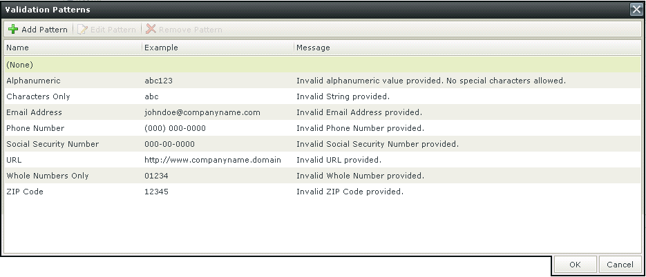
Patterns are regular expressions used to enforce validation on a certain control when data is captured. There are several validation types as shown below. Additional validation patterns can be configured and the validation error message can be customized. Creating a Pattern for “percentage” for example, would enforce validation on the selected control, which will fail if the user did not enter the value as “[Value][%]”.
When clicking on the ellipsis next to Pattern, the Validation Patterns screen opens:
| Feature | Description | How to use it |
|---|---|---|
| Add Pattern | Adds a new Validation Pattern | Click on Add Pattern |
| Edit Pattern | Edits an existing Validation Pattern | Click on Edit Pattern |
| Remove Pattern | Removes a Validation Pattern | Click on Remove Pattern |
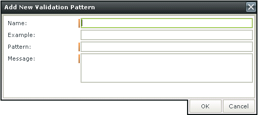
Click Add Pattern to add a new pattern. The Add New Validation Pattern screen opens
| Feature | Description | How to use it |
|---|---|---|
| Name | The name of the Validation Pattern | Type a name |
| Example | An example of the Validation Pattern such as abc for a Characters Only Validation Pattern | Type an example |
| Pattern | The regular expression for the Validation Pattern | Type the regular expression |
| Message | The message to be displayed if the input data does not match the regular expression | Type the message |
Please note when using a validation Pattern on a control, a
A custom Pattern can be created. Creating a Pattern for “percentage” for example, would enforce validation on the selected control, which will fail if the user did not enter the value as “[Value][%]”.
Click Add Pattern to add a new pattern. The Add New Validation Pattern screen opens

| Feature | Description | How to use it |
|---|---|---|
| Name | The name of the Validation Pattern | Type a name |
| Example | An example of the Validation Pattern such as abc for a Characters Only Validation Pattern | Type an example |
| Pattern | The regular expression for the Validation Pattern | Type the regular expression |
| Message | The message to be displayed if the input data does not match the regular expression | Type the message |
It is important to note the difference in applying validation Patterns to Item Views and Editable List Views.
When applying a validation Pattern to an Item View, the Rule Definition should look something like this:
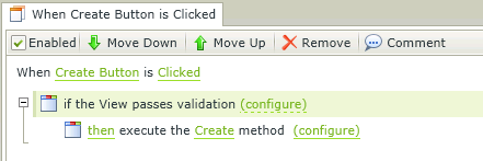
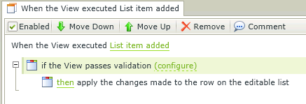
When applying a validation Pattern to an Editable List View, the Rule Definition should look something like this:
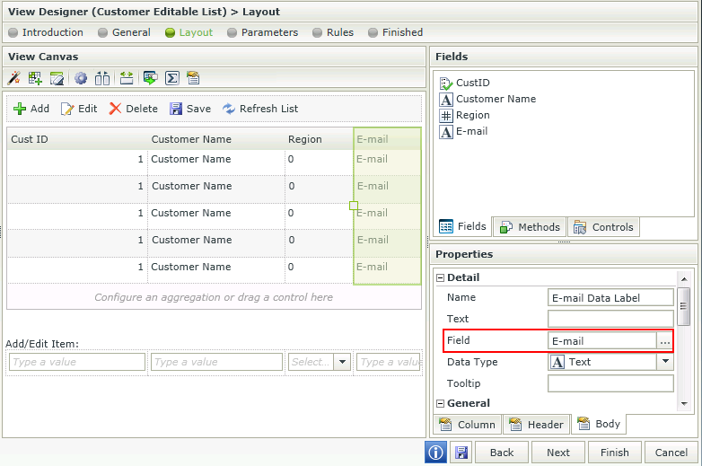
Control bindings are reflected in the Properties of the control. The Field property under the Detail section represents the field (SmartObject property) it is bound to.
Bindings can be removed by using one of the following methods:
- Unbind feature - Select the control and click the Unbind Control icon in the Toolbar. The Field property of the control is set to None.
- Set a property - Select the control, click on the ellipsis next to the Field property and select None.
Unbound controls will have a None value in the Field property and can be bound to a field by using one of the following methods:
- Set a property - Select the control, click on the ellipsis next to the Field property and select a field from the list.
- Drag and drop a field - Drag and drop the field from the Fields tab into the control. The Field property is set to the field.
Considerations
- If a property is deleted from a SmartObject, the control bound to that property will now be unbound when editing the View. Use one of the methods mentioned above to bind the control to another field.
- When mapping more than one control to the same Field, it is important to remember that the mapping is done to the control and the control is bound to the field. The field will be used in the Create, Save, Delete and Load methods.
- When changing the binding of the control to another Field, it is important to note that the control's Data Type property will change to match the Data Type of the new Field. However, the Styling, especially Formatting of the control will remain and needs to be changed by the designer if required.
Click here for information on Control Support