Tree Control
The Tree control displays a hierarchical list of values which can have sub nodes which expand and collapse. The nodes can represent headings in a document, the entries in an index, or the files and folders as in a file manager application. Parent nodes (nodes that contain other items) are called categories and child nodes are called items. Each node consists of a label and an optional image that you can customize. Use this control to:
- Display a menu of items with relationships, such as a list of regions and office locations or a family tree
- Display multiple parent-child relationships
When using the control, you can allow people to select single or multiple items depending on how you configure the control. You can use these selected items with rules, for example calling a Save or Load method to perform an action on items selected.
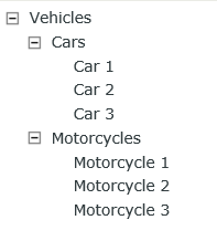
The following tree control shows a simple configuration with a root node, an expanded node, and a collapsed node.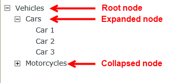
Try it yourself!
When you create data and configure SmartObjects to use as the data source for the control, make sure you set up the data and configure the data source correctly to display as you expect in the tree. See the Creating SmartObjects and Configuring Multiple Data Sources sections for information when you create your SmartObject and use multiple data sources. Follow the steps below to configure a scenario where the control uses a single data source on a view:
- Create a Vehicles SmartObject to act as a database containing information to use in the tree.

- Create an Editable List view from the SmartObject.
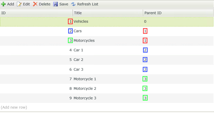
- Run the Editable List view and add the records as shown below. Note the color-coded links between the ID and Parent ID (The Parent ID is the value that binds a node to its parent). You use these properties to configure the data source and create the hierarchy for the tree. Since Vehicles has a Parent ID of 0 and it is the only item with Parent ID 0, it is the root node of the tree. Cars and Motorcycles have a Parent ID of 1, which creates sub-nodes under Vehicles. Car 1, Car 2 and Car 3 have a Parent ID of 2, which creates sub-nodes under Cars in the tree.
- Create a Vehicles Item view.
- Navigate to the Layout page and drag the control onto the canvas. The control is available in the Input section of the Toolbox.
- Configure the Selection Type property to indicate whether the control should allow single or multiple selections. Use Single for this scenario.
- Add a data source to your control. To do this, click the ellipsis next to Type under the Data Source of the Properties section.

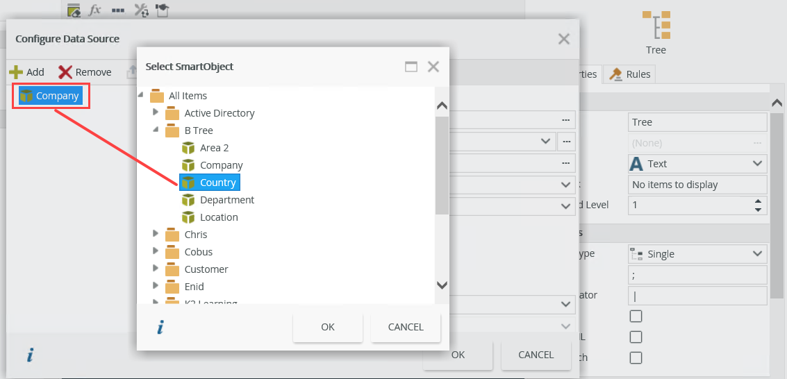
- The Configure Data Source page opens. Click Add and then click the ellipsis next to SmartObject.
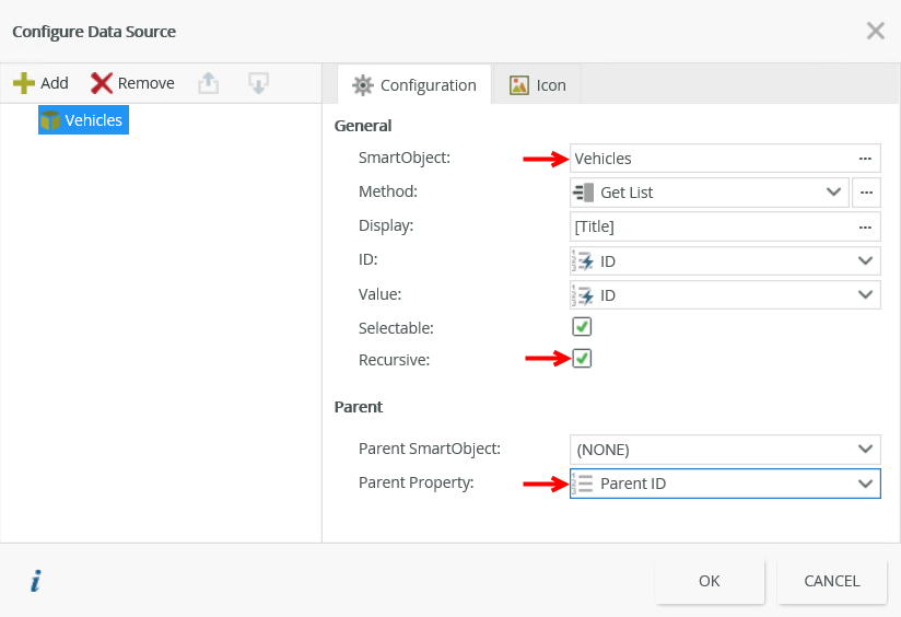
- Select the Vehicles SmartObject from the category tree. Mark the check box next to Recursive and select Parent ID next to Parent Property.
Click OK.
- Configure the rest of the properties as necessary. You can configure an icon to show next to the tree nodes. See the Configuring Icons and Configuring a Custom Icon sections for information on how to do this.
- Finish and run the view.
- Expand the nodes to view the data you created.
When you create a SmartObject or edit an existing SmartObject to use with the control, note the following:
- The SmartObject must include a property to use as the node location identifier of the control. This property is referred to as the Parent ID and determines where in the tree a specific value (item or category) appears.
- Use a unique name for the Parent ID property. The name of the property does not have to be Parent ID, but you should be able to easily identify it.
- You can add a Parent ID property to existing SmartObjects. If you do this, you should update the hierarchical structure manually by adding the new property to a view and editing the data if data already exists to ensure the data is linked to the correct parent node.
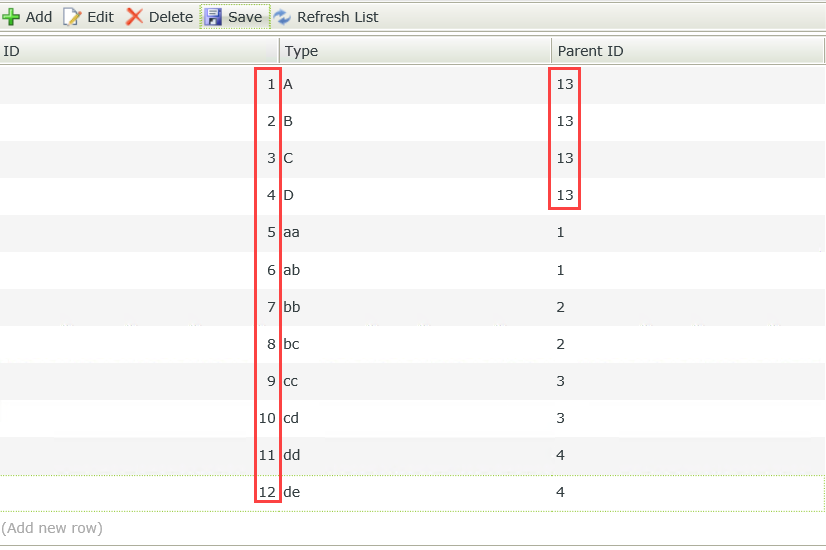
- When you use a single data source, any record where the Parent ID value is not valid displays as a root node. Consider the following example: suppose a data set has twelve records (with IDs 1-12). When you use the value 13 (or any number greater than 12) for the Parent ID property, those records appear as root nodes because there is no record with an ID of 13 to act as the parent node. In the sample data set Type A, B, C and D are shown as root nodes because there is no record with ID 13 that acts as a parent node for those items. In short, if the value of the property you use for the Parent ID is 0 or the value does not match a valid parent record, that record shows as a root node in the control.
The image below shows the data created above in a tree: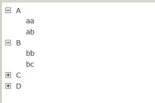
- When you use multiple data sources you don't have to configure associations between the SmartObjects but it can be useful. You must have properties with the same data that you can use to populate the control.
When you click the ellipsis next to Type under the Data Source of the Properties section, the Configure Data Source page opens. Click Add to configure the data source. You can configure the control to use a single or multiple data source.
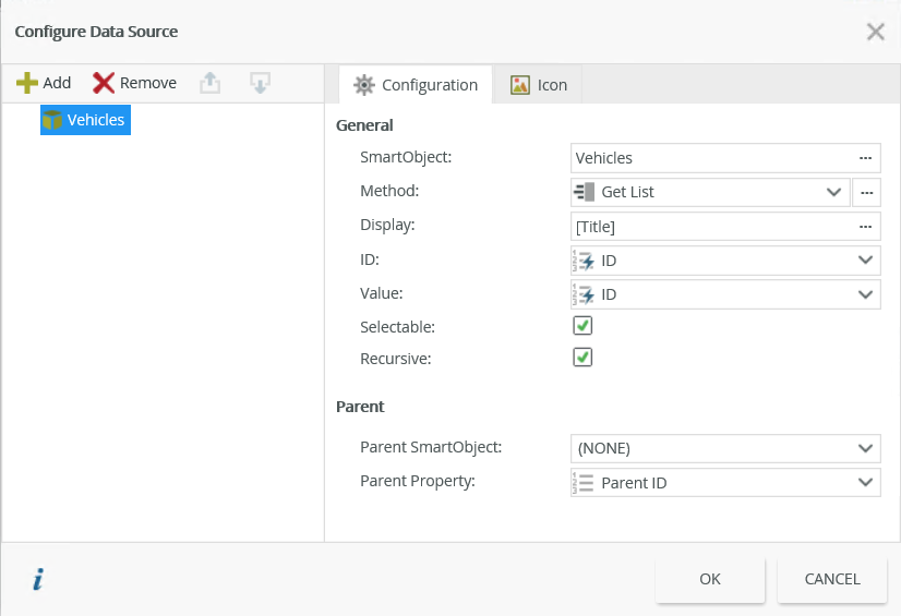
| Field | Description | |
|---|---|---|
| General | ||
| SmartObject | The SmartObject that you want to use as the data source for the control. Click the ellipsis next to SmartObject to select a SmartObject. | |
| Method | The method that you want to use to populate the control. This should be a list method. | |
| Display | The value you want to use to display the tree node. You can customize the value by clicking on the ellipsis and dragging fields from the Context Browser. | |
| ID | The identifier of the SmartObject. You can also transfer the path (which is recorded as ID,SmartObject) to or from the control and use the ID and SmartObject name. The ID is by default the Autonumber ID but can be changed to any field in the SmartObject. | |
| Value | The SmartObject property you want to use as the value for the control. | |
| Parent | ||
| Parent SmartObject | The parent SmartObject that you want to use to build the relationship between the parent and child SmartObjects. See the Configuring Multiple Data Sources section for information on how to use this. | |
| Parent Property | The parent property that you want to use when you link the parent node to child nodes. | |
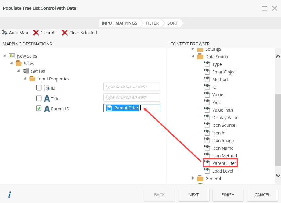
When you click the ellipsis next to Method on the Configure Data Source page, the Populate Tree List Control with Data page opens. On this page, you can use fields or parameters to set the control's input properties and apply filters and sorting to the results. If you work with large data sets, it is a good idea to apply a stricter filter to limit the number of items returned in the tree.
You can use multiple SmartObjects to populate the control for scenarios where the data you want to display using the tree control is not stored in a single SmartObject. When you use multiple SmartObjects as the data source, associations between the SmartObjects are useful but not necessary to populate the control. If you do not use associations, the subsequent SmartObjects need a field linking them to their parents (like you would need for cascading drop-downs).
The following images show an example of an association between the Province and City SmartObjects and how it displays in the tree.
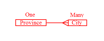
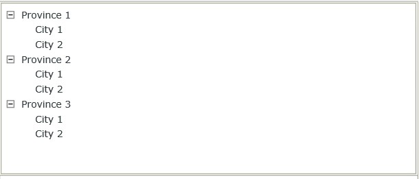
Follow the steps below to configure the scenario using multiple data sources:
-
Create Province and City SmartObjects as shown below:


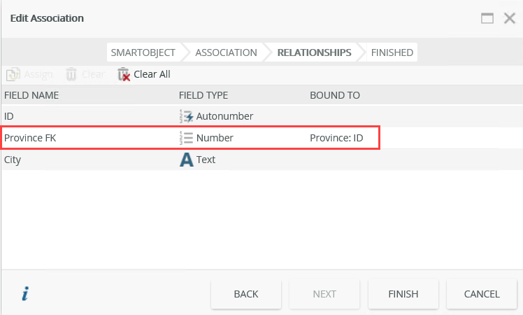
- Configure an association between the two SmartObjects that looks like the image below. Although associations are not required for linking multiple data sources, they are useful. If you do not want to use associations, you need a field in the child SmartObject to link that data to the parent SmartObject . In this an association is used for this purpose.
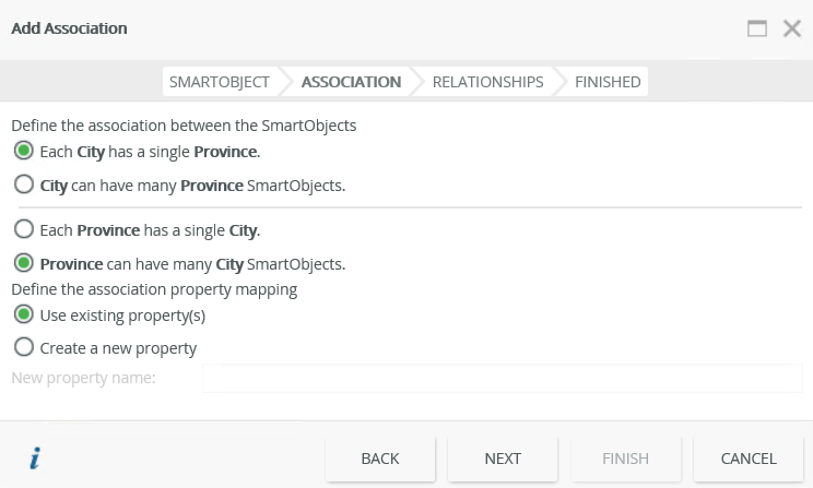
- Create a relationship between the Province: ID and City: Province FK properties as follows:
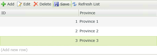
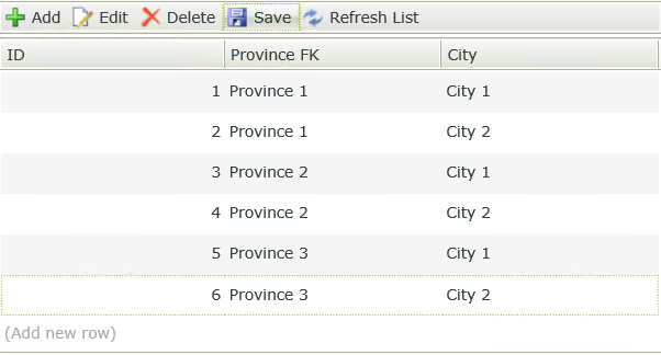
- Create Editable List views from the SmartObjects then add some records as shown below.
- Create an Item view.
- On the Layout page drag the control onto the canvas.
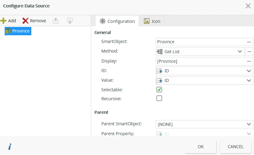
- Click the ellipsis next to Type under the Data Source of the Properties section. The Configure Data Source page opens.
- Click Add.
- Click the ellipsis next to SmartObject and select the Province SmartObject. Click OK.
- Click Add again.
- Click the ellipsis next to SmartObject and select the City SmartObject.
- Select City in the Display field under General, the Province SmartObject in the Parent section next to Parent SmartObject and the Province FK property next to Parent Property as follows:
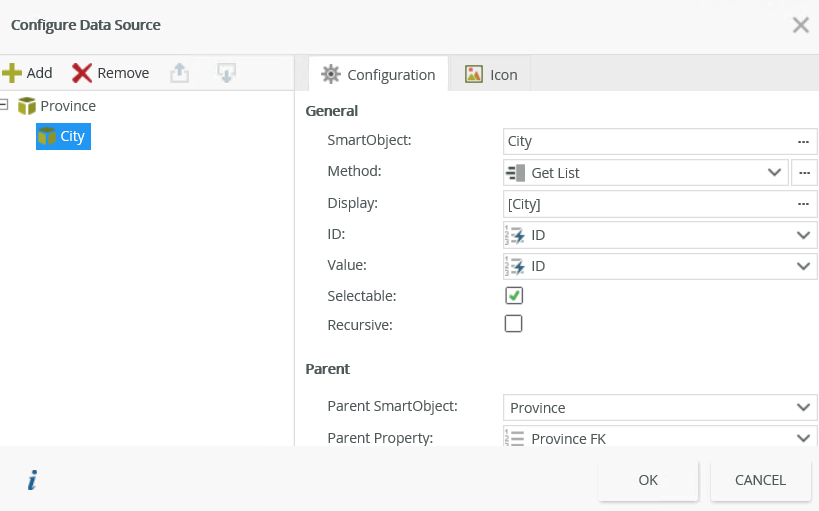
- Click OK.
- Finish and run the view.
- Expand the nodes to view the data.

When you drag the control onto the canvas, the Icon Source under the Data Source of the Properties section is bound to a system-defined SmartObject (System > Controls > Image > Tree Icons) called Tree Icons. (System Name: SourceCode_Forms_SFTreeIcons). You can also use custom icons in the SmartObject that you use as the data source or from a separate SmartObject.
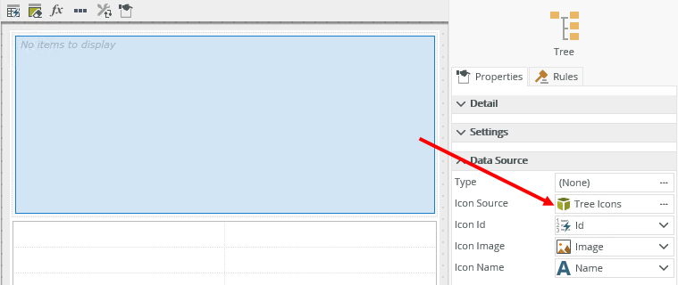
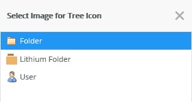
When you use the Tree Icons SmartObject, the following icons are available:
When you click the ellipsis next to Type under the Data Source of the Properties section, the Configure Data Source page opens. Configure a data source for your control, then click the Icon tab to configure the settings for the icons.
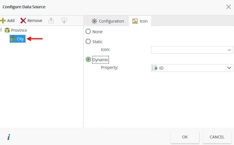
| Properties | Description |
|---|---|
| None | No icons display in the tree. |
| Static | Displays the image you select for all nodes of the tree. Click the ellipsis next to Icon and select an image. The images depend on the Icon Source and Icon ID you use. Use this option if you want to display one icon for all tree nodes. |
| Dynamic | Displays the properties of the current data source. This property is used as a lookup value using the Icon ID property under the Data Source of the Properties section.
The image below shows how the CountryID in one SmartObject links to the ID (Icon ID) of another SmartObject. Use this option if you want to display different icons for each tree node. |
You can use icons on different levels of the tree. To do this, select the data source, click the Icon tab and configure an option. In the image shown below, the icon applies to City.

Follow the steps below to create a SmartObject containing custom icons:
- Create a SmartObject (named Custom Icon in this example) with an Image property.
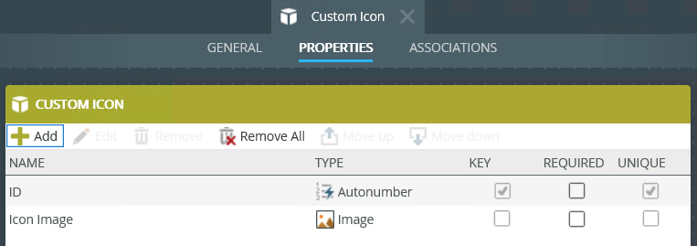
- Create an Item view from the SmartObject.
- Run the view and add a record containing an image.
- Create another Item view and add the control to the view.
- Click the ellipsis next to Icon Source in the Data Source section of the properties and select the Custom Icon SmartObject.
- Configure the rest of the settings under the Data Source section as shown here.
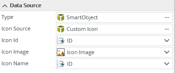
Properties Description Icon Source Select the SmartObject containing the icon image, in this example the Custom Icon SmartObject. Icon Id Select the property to identify the ID of the icon contained in the SmartObject. Icon Image Select the property of type image that you created in the Custom Icon SmartObject. Icon Name Select the property representing the name of the image. - Configure a data source for the control, then click the Icon tab.
- Select the Static option and click the ellipsis next to Icon.
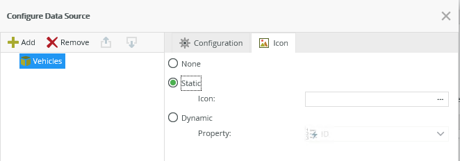
- Select your image and click OK.
- Click OK on the Configure Data Source page.
- Finish and run the view.
The control is available in the Input section of the Toolbox.

| Property | Description | Can be set at runtime using rules? |
|---|---|---|
| Detail | ||
| Name | A unique identifier for the control. This property is required and defaults to the name of the control. | No |
| Field | The field bound to the control. See the Binding Fields to Controls section for more information on how to use it. | No |
| Type | A drop-down list containing the types of values that the control can accept. | No |
| Watermark | Specify the text to display when the control is not populated. |
Yes |
| Load Ahead Level | Allows you to load the SmartObjects on different levels when the view initialize. This property is especially useful when you using multiple data sources. The property is set to 1 by default, loading the first level on view initialization. You can change the property to the number you need, All Levels, and None. None does not load any levels ahead and the All Levels setting loads all nodes ahead. It is important to note that using the All Levels setting may impact performance of the tree depending on how many items you're loading. |
Yes |
| Settings | ||
| Selection Type | Allows you to select single or multiple items in the tree. | No |
| Delimiter | Specify the delimiter to use when you save the values into the SmartObject. The property defaults to ";" (semi-colon). |
Yes |
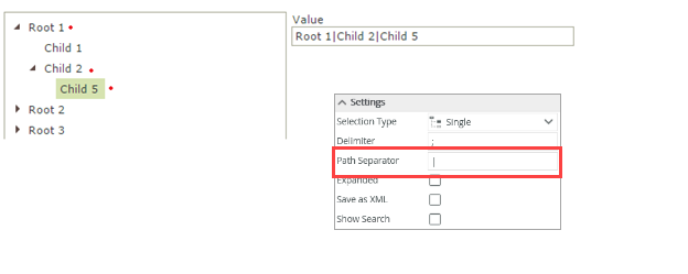
| Path Separator | Separates each value node concatenated from the root to the selected node. This is called the Value Path. | No |
| Expanded | Expands the tree when the view opens. | No |
| Save as XML | Saves the tree information in XML format. Use this to integrate with the Check Box List control which uses XML | No |
| Show Search | Enables a search toolbar that allows you to search (at runtime) for specific values. The search function returns categories and items matching the search criteria. | No |
| Data Source | ||
| Type | Configure a data source for the control. | No |
| Icon Source | The SmartObject that contains the image for the icon. See the Configuring Icons section. | No |
| Icon ID | The property used to identify the ID of the icon in the SmartObject. See the Configuring Icons section. | No |
| Icon Image | The property used to identify the image of the icon in the SmartObject. See the Configuring Icons section. | No |
| Icon Name | The property representing the name of the image. See the Configuring Icons section. | No |
| General | ||
| Height | Adjusts the height of the control. You can enter any whole number or pixel value between 1px and 32767px. |
Yes |
| Width | Adjusts the width of the control. You can enter any whole percentage up to 100%, whole number or pixel value to a maximum of 32767px. Type the dimension. |
Yes |
| Visible | Shows or hides the control. |
Yes |
| Enabled | Enables or disables the control. |
Yes |
| Read-Only | Shows the control as read-only. |
Yes |
| Format | Opens the Format page where you can configure formatting and style features such as format, font, borders, padding and margins. See the Format topic for more information. | No |
| Conditional Format | Opens the Conditional Formatting page. You can add conditional formatting to apply a specific format or style when a condition you set is True. Use conditional format on its own or with the Format feature. See Conditional Format for more information. Click the ellipsis to open the Conditional Formatting page. | No |
The control interacts with other controls through rules. When you bind properties between different controls, you can use the data to populate properties or set values. Use the following examples for when to use the control with other controls through rules:
- Set a control’s properties: You can configure the settable properties of the control with this action
- Show/Hide: The Visible property allows you to show or hide the control through rules
- Enable/Disable: The Enabled property allows you to enable or disable the control through rules
- Data Transfer: You can transfer items listed in the context browser to the control
- Execute a control's method: You can configure the control's methods with this action
- Specify edit state of view and form controls: You can specify if controls must be read only or editable
The following events and methods are available on the control:
Rule Events:
- When [control] is Changed: You can execute a rule condition or action when the control is changed, for example selecting an item or transferring a value to the control
- When [control] is Changing: You can execute a rule condition or action just before the changed event executes
- When [control] is Collapsed (node): You can execute a rule condition or action when a node is collapsed
- When [control] is Double-Clicked: You can execute a rule condition or action when a node is double-clicked
- When [control] is Expanded (node): You can execute a rule condition or action when a node is expanded
- When [control] is Initializing: You can execute a rule condition or action when the view or form is loading
- When [control] is Nodes-Populated: You can execute a rule condition or action when a node or nodes are populated
- When [control] is Populating: You can execute a rule condition or action when the control is populated. The populated event fires when the control is populated on view initialize and also when a node is expanded (on a multiple data source tree), except when the expanded property is enabled (in this case it will only fire on view initialize)
Control Methods:
- Execute a control's Clear Selection method: Clears the selection in the control, i.e. all selected nodes are unselected
- Execute a control's Collapse All method: Collapses all nodes so that only first level parent nodes are visible
- Execute a control's Collapse Node method: Collapses the current node to show only its parent node
- Execute a control's Expand All method: Expands all nodes to the lowest level
- Execute a control's Expand Node method: Expands parent node to the lowest level
- Execute a control's Find Node method: Expands, finds and selects a node. This method only accepts Value, NOT Value Path, or Path. Configure the parameter in the mapping destinations:
- Value - Change each SmartObject’s Value to that of the display field to avoid duplicate Autonumber IDs not drilling down to child nodes
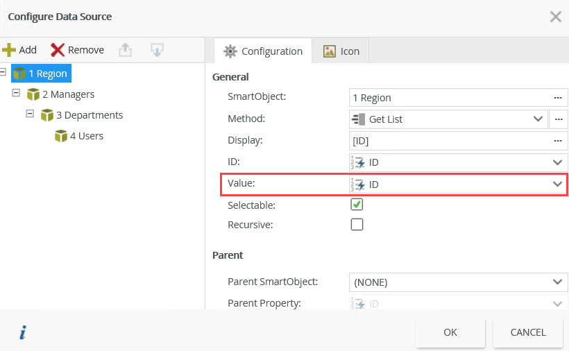
- Value - Change each SmartObject’s Value to that of the display field to avoid duplicate Autonumber IDs not drilling down to child nodes
- Execute a control's Populate method: Populates the control with SmartObject data
- Execute a control's Populate Node method: Populates child nodes of a particular node path of the control with SmartObject data. Use this method to enhance performance by loading a specific node of the control without populating the entire tree. You can not use this method to set the Path, Value, or Value Path. Nodes are not selected or expanded when you use this method – see the Select Node and Select All Nodes methods if you want to do this. Configure the parameters in the mapping destinations:
- Node Path - Specify the node path without ending path separators. This is a required field
- Force Refresh - Refreshes the state of a specific node. The default is false
- Recursive - Recursively populates the children of the node. The default is false
- Execute a control's Populate Selected Nodes method: Populates any selected (checked) nodes of the control with SmartObject data. Use this method to enhance performance by loading child nodes of the selected node of the control without populating the entire tree. You cannot use this method to set the path, value and value path. When you use this method, child nodes are not selected or expanded. Configure the parameters in the mapping destinations:
- Force Refresh - Refreshes the state of the nodes or children you selected. The default is false
- Recursive - Recursively populates the selected nodes or children. The default is false
- Execute a control's Populate Selected Nodes method: Populates any selected (checked) nodes of the control with SmartObject data. Use this method to enhance performance by loading child nodes of the selected node of the control without populating the entire tree. You cannot use this method to set the path, value and value path. Child nodes are not selected or expanded when using this method - see the Select Node and Select All Nodes methods if you want to do this. Configure the parameters in the mapping destinations:
- Force Refresh - Refreshes the state of the selected nodes or children. The default is false
- Recursive - Recursively populates the selected nodes or children. The default is false
- Execute a control's Refresh Node method: Refreshes the state of a specific node. It allows you to refresh the current selection via the control’s Path value (Value and Value Path are not accepted for this method). Expand the node by configuring the parameter and setting the Expand property to true
- Execute a control's Select All Nodes method: Selects (checks) all populated nodes. This method only applies to a multiple data source tree
- Execute a control's Select Node method: Loads, selects (checks) and expands the specified node path. This method requires an action to load the root nodes (load ahead level 1) before this method is performed. Configure the parameter in the mapping destinations:
- Node Path - Specify the node path without ending path separators. This is a required field
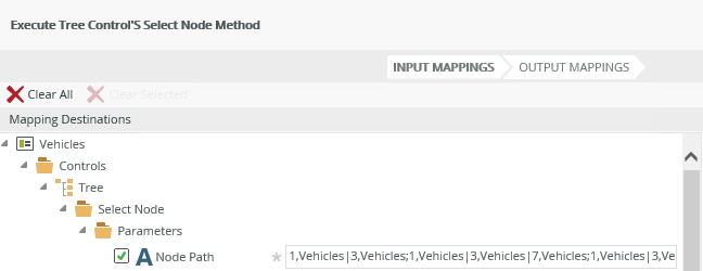
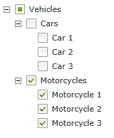
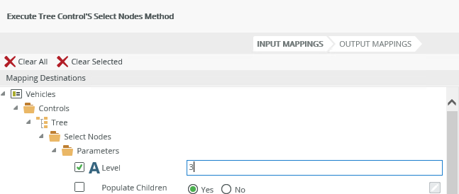
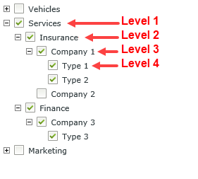
- Execute a control's Select Nodes method: Selects a set of nodes at a level. This method requires an action to load the root nodes (load ahead level 1) before this method is performed. Configure the parameters in the mapping destinations:
- Level (number) - A single level of nodes. Level 1 represents the root nodes. If this parameter is empty, nothing is selected
- Populate Children - Populates the children of the nodes. The default is false.
When you use a rule action to set the properties of the control, note the data source options of Value, Path and Value Path:
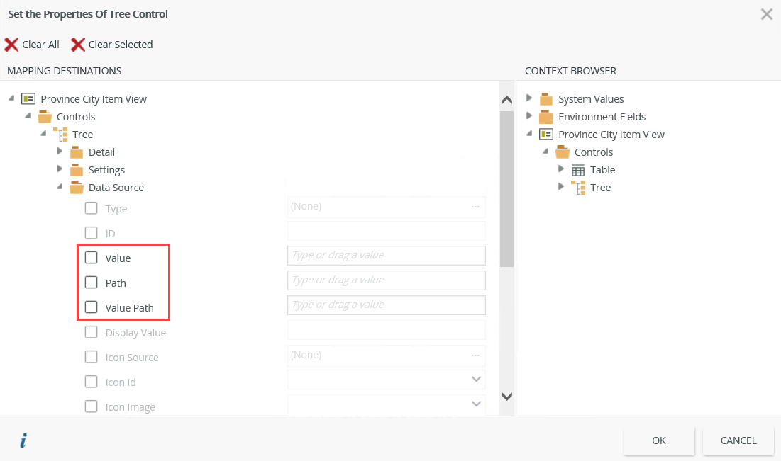
- Value - The value of the node that you select in the tree is the value returned from the property selected on the Data Source page. You can use the property to set a node.
Setting the tree with a value however cannot guarantee the correct selection.


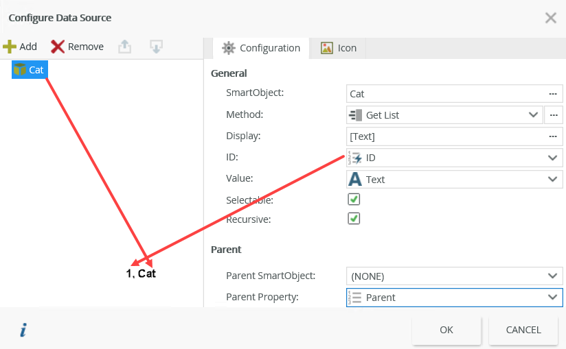
- Path - The path property contains the exact path for each node you select. When you set the same tree with a path value, nodes are guaranteed to be selected

For each node, the path contains the ID property value, and then the system name of the corresponding source.
- Value Path - The value path property is each value node concatenated from the root to the node you select using the control property Path Separator.
Setting the tree with a value path cannot guarantee the value is unique.
-
On a multiple data source tree, it is possible that records from different SmartObjects can have the same value for the ID property. To work around this, you can tier transferred values. Consider the image below:
In the above image above two items in the tree (South Africa and Gauteng) have the same ID value of 1. If an ID is common between multiple items, only the first level with that value is transferred. In this example, if 1 is transferred, only South Africa is selected. For this reason transferred values can be tiered as shown in the text box: The first value is the ID value, the second is the SmartObject name. If you want to select Gauteng in the tree, the value is: 1,Province because 1 is the ID of Gauteng and Province is the name of the SmartObject containing the record Gauteng. If you want to select China, the value is 4,Country because 4 is the ID value for China and Country is the name of the SmartObject containing the record China. - The data is a delimited list of values that the control saves and loads. It is important to always have a delimiter specified, usually a semi-colon (;)
- You cannot use the control on forms. It can only be used on views
- The control does not support the populate list control with data rule action as the tree uses more than one source to load its data and the populate list control action only works with controls containing a single data source
- When you use multiple data sources, data associations are not required between the SmartObjects but can be useful. You must have properties with the same data that you can use to filter the control to ensure correct population of the tree. See the How to use multiple data sources section
- The Expanded property is not selected by default. This means that the lowest level nodes shows the expander (icon) until you click the expander, then it disappears and items are displayed for that category
- When you select the Expanded property option, data to populate the tree control is retrieved when the control loads. This may cause a delay and is not recommended when you use large data sets to populate the control
- When a parent or root node is expanded to expose child nodes, selecting a parent or root node selects child nodes as well. However, if root or parent nodes remain collapsed, selecting that node will NOT select child nodes
- The Execute a control's Refresh Node method is affected by the control’s Expanded property. If the Expanded property is enabled and you use this method, the node refreshes but any child nodes remain expanded
- When you use the Multiple selection option and you select a parent node, it only selects the parent node. Children nodes are only selected when you expand the parent
node first:
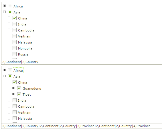
- When you use the Multiple option, the category node does not contain the value and selecting a category selects all items in that category. This is useful to transfer values for further action. If a parent is collapsed, you can select it as a value
- When you use the Multiple option, you can set the Value property to indicate which value should be selected by default. Use a semi-colon as the delimiter to set multiple values. Below is an example of where the Multiple option is selected and the Value is set to 2;8. Note the hierarchical order of the nodes
- If you have a multiple data source tree, any of the SmartObjects' Selectable properties are disabled on the Configure Data Source page, and you select Multiple in the Selection Type control property, these values behave as if they are read-only. At runtime you can select the check-box but the values of the SmartObject will not transfer through rules. If you have a single data source tree, you cannot disable the Selectable property of the SmartObject
- When you select the Recursive property on the Configure Data Source page, you cannot set the Parent property to a type of ID as this creates an infinite loop
- No data displays in a single source tree until you enable the Recursive property
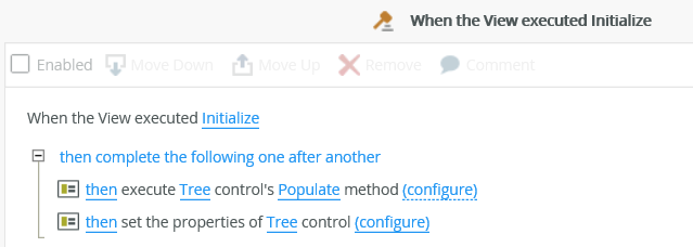
- Your view may load slowly when you have large data sets and you’re using the Execute a control's Find Node method method to set a value in the control. The solution is to use the set the properties of the control action in the Initialize event, which prevents the rule from trying to find a node that may not be populated yet. Putting this logic in the initialize event allows the tree to be fully populated first before the value is set
- Using Icons:
- When you configure a Static icon, and remove or change the Icon Source, the Static value is invalid for a cleared source and unknown for a new source, so the control resets the option to None
- When you configure a Dynamic icon and remove the Icon Source, no source exist, no link can occur, and the property is reset to None
- When you configure a Dynamic icon and change the Icon Source, the link is dynamic and the properties presented in the Dynamic option is the data source’s properties, so the option remains dynamic
- When you change an already configured data source as shown below, if Static or Dynamic options were selected, they are reset to None
