Calendar Control
The Calendar control allows you to select date and time from a calendar. You can configure the Picker Type property of the control to use Date
 , Time
 or Date and Time
 . See the Date and Time Use Cases section for information on which one to use.
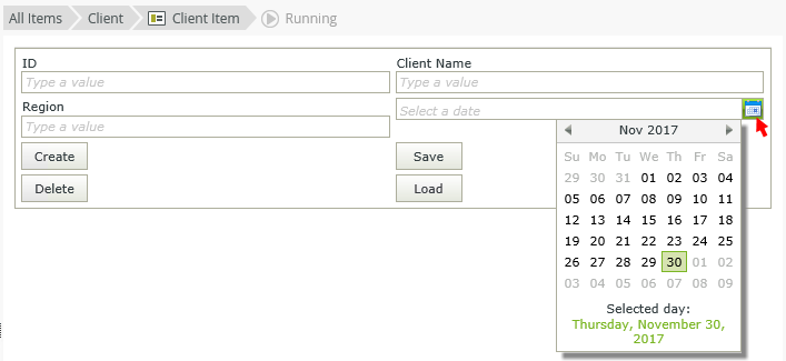
Try it yourself!
See the following resources for more information:
- See How To: Create an Exchange Appointment Form for an example of customizing the control's Picker Type property.
- Create a view.
- Drag the control onto the canvas. You can find the control in the Input section of the Toolbox.
- Configure the Picker Type property.
- Configure the rest of the properties as necessary.
- Run the view.
Use the information below to determine where and when to use the following data types:
- DateTime - Allows you to specify a Coordinated Universal Time (UTC) that shows the time in the local timezone.
- DateTime (with timezone) - Allows you to use a UTC time that does not vary based on the local timezone, see configuring a time zone
- Date - You can use this for a timezone-invariant date (no time).
- Time - You can use this for a timezone-invariant time (no date).
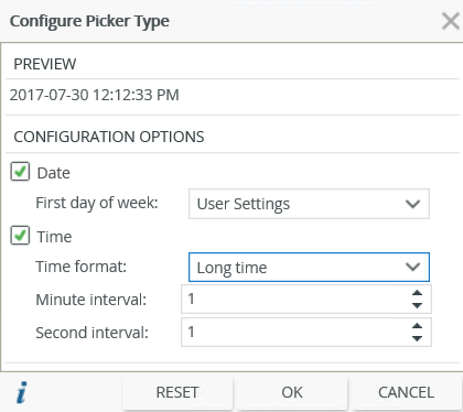
When you click on the ellipsis next to the Picker Type property, the Configure Picker Type page opens. Select the options you need based on the preview and your scenario.
| Fields | Description |
|---|---|
| Date | |
| First day of week | The day to start the week for your organization. User Settings uses the default value of your browser culture. Alternatively, select a day from the list. |
| Time | |
| Time Format |
The way time is shown. The following options are available:
|
| Minute interval |
Adjust the minute interval by using the up and down arrows. The following intervals are available:
|
| Second interval |
Adjust the second interval by using the up and down arrows. The following intervals are available:
|
| Reset | |
| Reset | Resets the values to the default date and intervals. |
The control allows you to have a 12 hour (AM/PM) or 24 hour clock displayed in the picker. This is useful when you have customers in different countries with different culture settings. There are three items to consider when you use the Calendar picker as they work together and influence the display of the picker and control:
- Picker Type property - Determines the format of the Date and Time to display in the Calendar picker and whether to display it as a 12 hour (AM/PM) or 24 hour clock.
- Date and Time format applied to the control - Determines the display of the value in the control.
- Browser culture - Determines the format of the Long time and Short time.
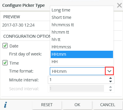
When you use the Time Format option of the Picker Type property you have the following options:
- Long time - Displays either as hh:mm:ss tt or HH:mm:ss depending on whether the culture of the control as configured on the Format page has a default 12 hour or 24 hour clock configured
- Short time - Displays either as hh:mm tt or HH:mm depending on whether the culture of the control as configured on the Format page has a default 12 hour or 24h clock
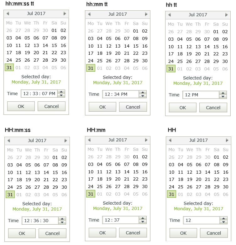
- hh:mm:ss tt - Displays as a 12 hour clock
- hh:mm tt - Displays as a 12 hour clock
- hh tt - Displays as a 12 hour clock
- HH:mm:ss - Displays as a 24 hour clock
- HH:mm - Displays as a 24 hour clock
- HH - Displays as a 24 hour clock
Explanation of the notations:
h = hour
m = minute
s = second
tt = AM/PM
h/H = 12/24 hour
The Calendar picker icon shows the type of picker you select when you configure the control. Depending on the type of picker, you can configure a date and time. The time displays according to the Date/Time culture settings used in respect of a 12-hour or 24-hour clock. Specify a time by clicking on the hours, minutes or seconds, then use the up and down arrows. The time intervals apply according to the intervals you configure for the picker. Alternatively, type the required hours, minutes or seconds. For more detail see the Picker Type
The examples below show the different time formats based on the Time Format settings that you configure:
You can find the control in the Input section of the Toolbox.

| Properties | Description | Can be set in runtime |
|---|---|---|
| Detail | ||
| Name | A unique identifier for the selected control. This property is required and defaults to the name of the control. |
|
| Default Value |
Populates the initial value of the control in runtime. Use one of the following values:
|
Yes |
| Field | The field bound to the control. See the Binding Fields to Controls section for more information on how to use it. | No |
| Data Type | A drop-down list containing the types of values that the control can accept. See the Date/Time Use Cases section. | No |
| Watermark | The text to display when the control is not populated. |
Yes |
| Tooltip |
The value to display when the cursor hovers over the control. |
Yes |
| Settings | ||
| Picker Type | Enables you to configure the control to use Date
 , Time , Time  or Date and Time or Date and Time  . These settings apply when you click on the Calendar picker in runtime. . These settings apply when you click on the Calendar picker in runtime. |
No |
| General | ||
| Width | Adjusts the width of the control. You can enter any whole percentage up to 100%, whole number, or pixel value (maximum of 32767px). |
Yes |
| Tab Index | Defines a sequence that users follow when they use the Tab key to navigate through a page at runtime. |
Yes |
| Visible | Shows or hides the control. |
Yes |
| Enabled | Enables or disables the control. If the control is disabled, you won't be able to use it. |
Yes |
| Read-Only | Shows the control as read-only. |
Yes |
| Expression | Opens the Expression Builderto configure expressions to populate the control with dynamically calculated values. |
Yes |
| Format | Opens the Format page where you can configure formatting and style features such as format, font, borders, padding and margins. See the Format topic for more information. | No |
| Conditional Format | Opens the Conditional Formatting page. You can add conditional formatting to apply a specific format or style when a condition you set is True. Use conditional format on its own or with the Format feature. See Conditional Format for more information. Click the ellipsis to open the Conditional Formatting page. | No |
- The control is also available when you use forms
- You can use Date and Time expressions on the control to dynamically calculate dates, days of the week, start and end of a quarter, and more
- You can use the Transfer data rule action to transfer values to and from the control. You can use static text, values from another control, or system values from the Context Browser
- The Date and Time Format settings determine the display value of the date and time
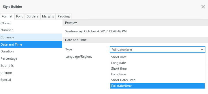
- When you apply a Date and Time format using the Format property, it is important to keep the format in sync with the settings of the Picker Type property to ensure correct expected behavior. For example, when you use Full date/time format on the Format page and you select the Time option in the Picker Type property, the value displays in Full date/time format, but when you click on the Calendar picker, you can only edit the time
- When you select Date and Time or Time in the Picker Type property, the Time value in the picker shows either a 12-hour or 24-hour clock picker depending on the culture settings
- You can use the Focus control method in the Rule Designer to set focus to the control in runtime
- The control does not support validation on manual input when the form is offline. You can use the calendar picker in offline mode
- You can use the control with forms saved as a draft in the K2 Workspace (Mobile) app to save the data on the form to resume at a later point or to work on the form while offline. See How To: Configure Forms with Draft Functionality, Drafts in Android and Building SmartForms for Mobile Devices for more information on saving a form as a draft in the K2 Workspace (Mobile) apps.