Item Views
Use Item views to read and capture information related to single records, such as shown here.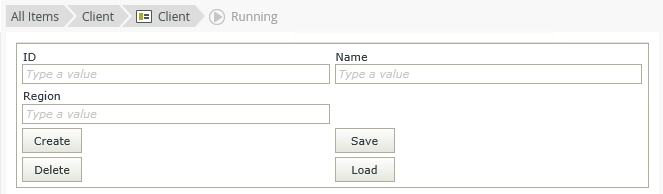
You have two options when the view is empty: You can Create Labels and Controls based on the SmartObject you selected on the General tab, or you can generate a blank layout table for inserting controls. If you want to get back to an empty view, click the Clear canvas button in the toolbar. 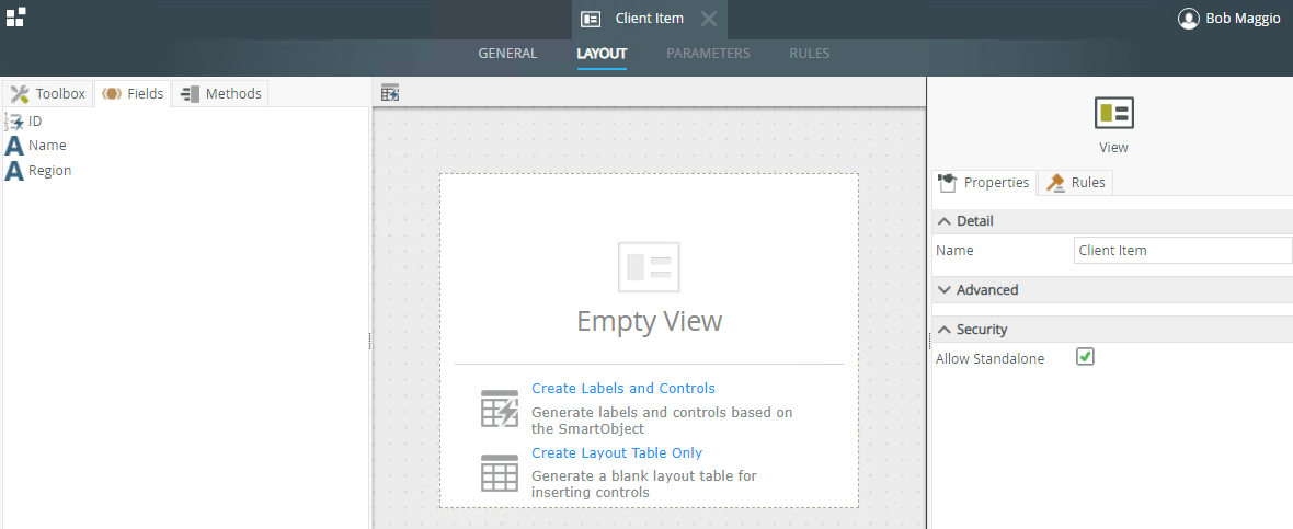
 Create Labels and Controls
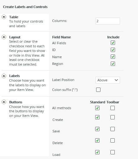
Selecting the first option, Create Labels and Controls, allows you to specify the details for creating the table, layout, labels, and buttons. Clicking OK automatically generates the view.
| Feature | Description | How to use it |
|---|---|---|
| Table | Specify the size of the table to hold the controls and their labels | Enter the number of columns you need |
| Layout | Specify the SmartObject fields that you want to show on your view. | Select the fields you want to show on your view |
| Labels | Label Position: Specify where the labels appear in relation to the controls:
|
Select the option to be used |
| Buttons |
Represents the methods from the SmartObject you selected as the data source. If checked, a button is added on the view for the method. Standard - Buttons are placed at the bottom spread across columns and rows Toolbar - Buttons are placed at the top in a toolbar |
Select the methods and placement |
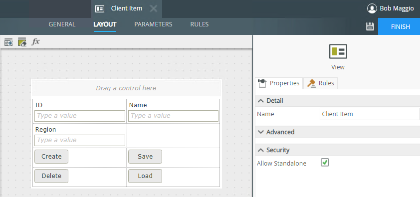
You can now start customizing your view using controls, fields, methods, and rules.
| Properties | Description | Can be set in runtime using rules? |
|---|---|---|
| General | ||
| Name | A unique identifier for the cell. | No |
| Format | Use this property to apply background color and padding to a cell. | No |
Create Layout Table Only
Select Create Layout Table Only to design the view by dragging fields, methods and controls onto the canvas. You can also drag fields and controls (available in the Toolbox) directly onto the canvas when creating a new view.
Layout
See the Get to Know the Canvas topic to familiarize yourself with the Layout tab and how to use the components on the canvas.
Control Support
Controls are supported differently based on where you drop them and the type of view you're designing. See the topic Binding Controls for information on how to bind and unbind a SmartObject field from a control. You can use bound and unbound controls in all zones of an item view.